 SeriesNo Filter
 SeriesNext Level
 SeriesOn Mission
Nov04
Wednesday Night: Real Talk
7:00 PM · Student Hall
Anonymous questions answered on stage.
Student nights every Wednesday. Worship, games and real talk. Show up, bring your friends, stay as long as you want.
PULSE is a place for students to ask real questions, laugh hard and find people who have their back. No lectures. No fake. Just loud music, honest talk and a crew that shows up for you.
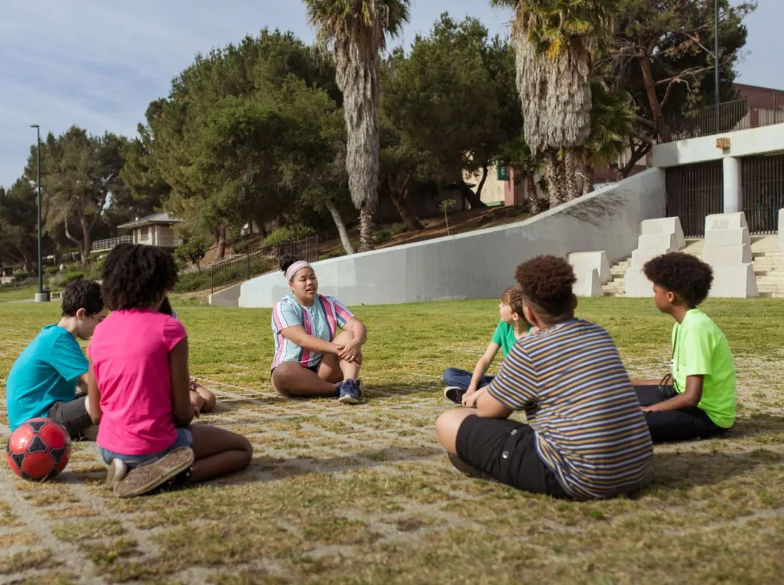
Six days in the Rockies. Worship at night, adventure by day, friendships that last. Early-bird registration opens in January.
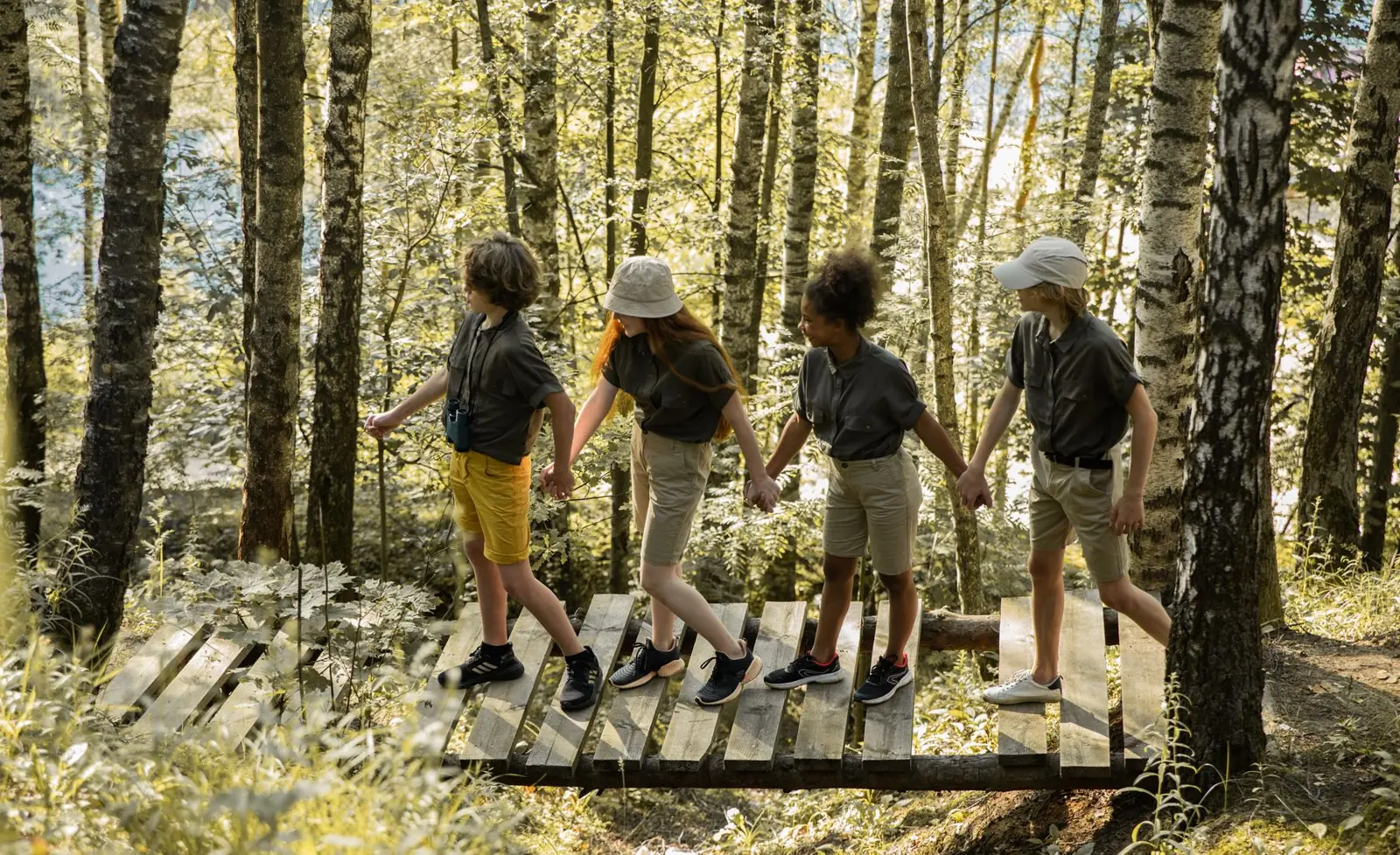
Let no man despise your youth; but be thou an example of the believers.1 Timothy 4:12 (KJV)
Anonymous questions answered on stage.
Write letters and make care packages for local vets.
A cozy night of acoustic songs and hot cocoa.
Your gift sends students to camp and keeps Wednesday nights free for everyone.
Design notes
Pulse is a student ministry site with a black background, huge condensed uppercase headlines and a tilted confetti photo. It is loud on purpose, because teenagers will leave a site that looks like their parents' church.
Anton, a tall condensed display face, is set in capitals at about 150 pixels and fills the left half of the hero. Work Sans carries body copy and the small monospace-style labels. The extreme difference in scale between headline and paragraph gives the page a poster feel.
The dark theme is first. Black (#0B0B0B) is the base, white is the text, and acid lime (#D7FF3F) is the brand colour with a hot red-orange (#FF5A3D) accent. The light theme flips to off-white with a red accent (#D6381B). Lime on black is a recognisable youth-culture combination, and it stands apart from the usual church palette.
A plain top bar carries the logo, six links and a Give button, then the page goes full-width black with fine diagonal stripes. Cards are outlined with hard edges and no rounding, which gives a brutalist look. The structure is simple, so the loud type is the only thing a visitor has to process.
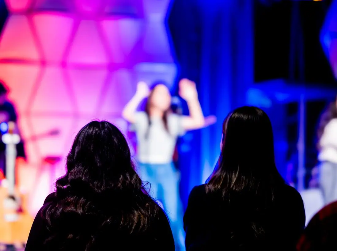
The hero is a poster. 'YOUR GENERATION. YOUR MOVE.' is stacked across three lines in white, with a rotated photo of confetti under stage lights tilted at the right edge. The tilt gives the page movement without needing animation.
'Get on the list' is a red-orange rectangle and 'Watch highlights' is an outlined rectangle. A student can join without a long form. Give is a small black button in the header, kept out of the way because students are not the audience for it.
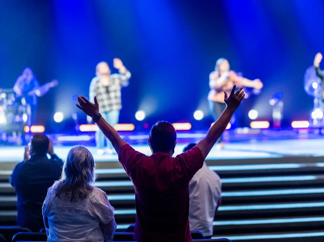
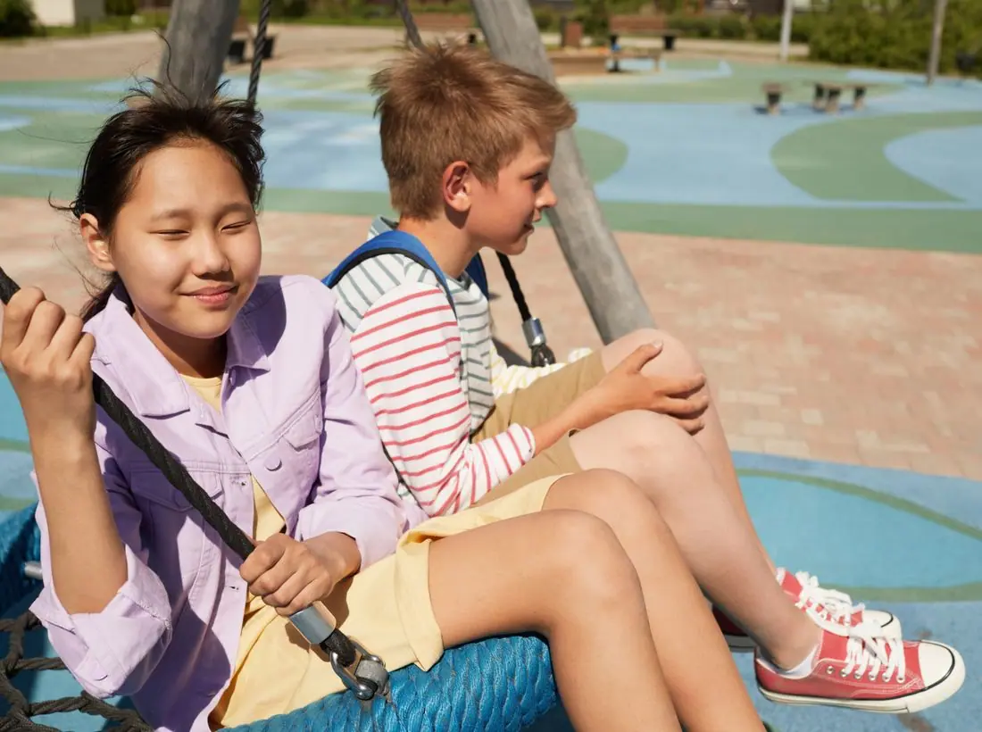
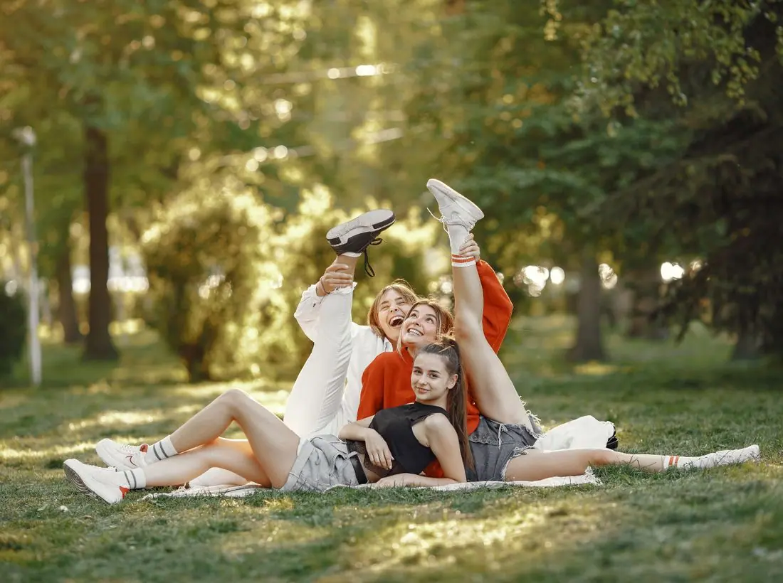
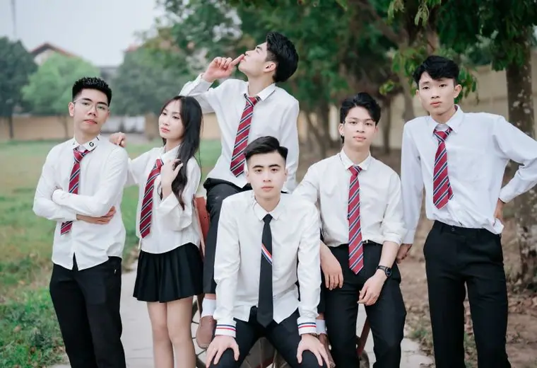
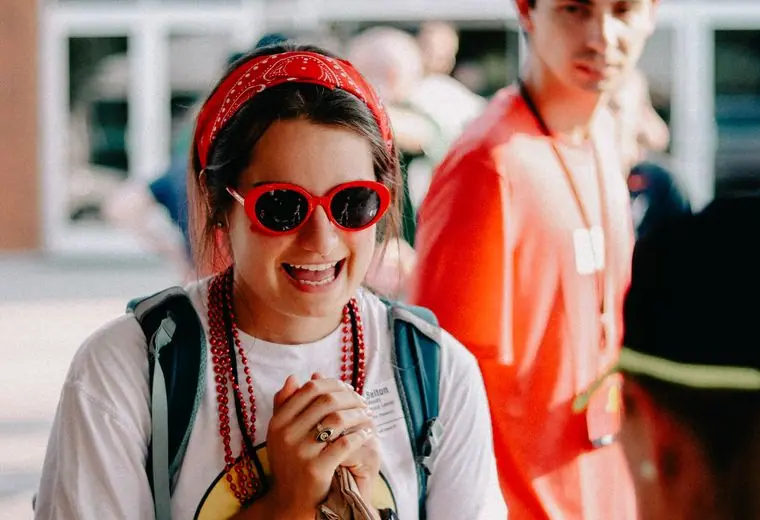
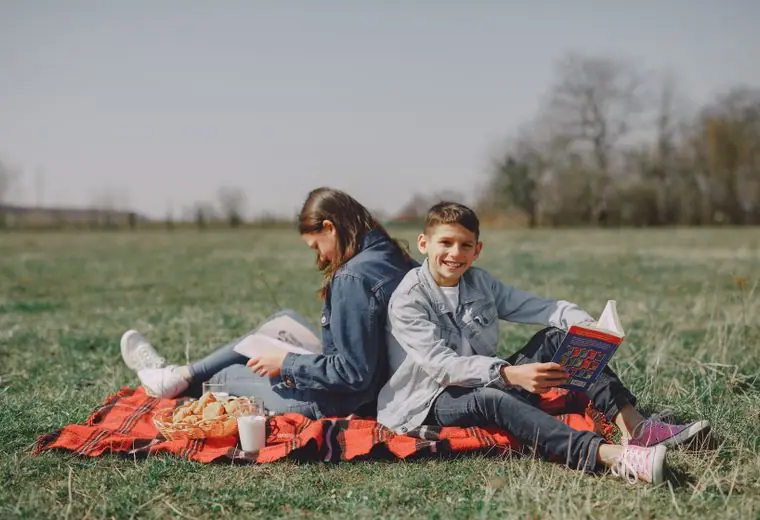
The photos are high-energy concert and stage shots, with confetti and coloured light. They show an event rather than a classroom. Because students are minors, a real build should photograph only with consent, and show crowds or backs of heads rather than identifiable faces.
White text on black measures about 20 to 1. The huge headline stays readable at every size, and labels are uppercase with wide spacing. The diagonal stripes are low contrast and sit behind the text without reducing legibility. A theme toggle is provided in the header.
Each text pairing is checked against WCAG 2.2 in both themes. Ratios are computed from the exact theme colours.
| Pairing | Sample | Ratio | WCAG |
|---|---|---|---|
| Body text on page | Aa | 19.68:1 | AAA |
| Body text on cards | Aa | 17.76:1 | AAA |
| Secondary text | Aa | 9.71:1 | AAA |
| Secondary text on tinted bands | Aa | 7.02:1 | AAA |
| Links and labels | Aa | 17.12:1 | AAA |
| Button text | Aa | 17.12:1 | AAA |
| Accent button text | Aa | 6.36:1 | AA |
| Footer text | Aa | 19.68:1 | AAA |
| Pairing | Sample | Ratio | WCAG |
|---|---|---|---|
| Body text on page | Aa | 18.00:1 | AAA |
| Body text on cards | Aa | 19.68:1 | AAA |
| Secondary text | Aa | 7.27:1 | AAA |
| Secondary text on tinted bands | Aa | 5.35:1 | AA |
| Links and labels | Aa | 18.00:1 | AAA |
| Button text | Aa | 19.68:1 | AAA |
| Accent button text | Aa | 4.73:1 | AA |
| Footer text | Aa | 18.00:1 | AAA |
Designed by Greater Purpose Web. Names, people, photos and events are sample content.