Why Open Doors looks the way it does
Open Doors is a family church site with a peach background, a heavy navy headline and a rounded photo of a child with a toy camera. The colours and shapes are playful, so parents see straight away that children are expected and welcome.
- Built for
- Young parents, grandparents bringing children, and families who worry that a church service will not suit small kids.
- Navigation
- Floating rounded pill that sits over the hero photo. On phones, a bottom tab bar plus a quick-links launcher.
- Pages
- Home, About, Visit, Kids & Family, Messages, Events, Give, Contact
- Hero
- Headline beside a framed photo, with a small inset and the next-gathering chip.
Typography
Bricolage Grotesque at extra bold sets the headline. It is a slightly quirky grotesque with tight, chunky letters, and it gives the headline personality without looking childish. Nunito supplies the body text with round ends that match the pill buttons. The pairing is lively enough for families but still reads as a serious sentence.
Colour
The page uses warm cream (#FFF8EC) with navy text (#1F2A44), a tomato orange (#E4572E) for buttons and a teal (#2EC4B6) accent. The hero background is a peach tint of the orange. Navy gives the playful orange and teal a stable base, so the page stays readable.
Layout and navigation
A rounded white pill navigation floats at the top with Give as an orange pill. The structure then moves through tinted cards and circular icons, with a rule of one idea per card. Kids and Family has its own nav item, so parents do not have to search for it.
The hero
A split hero puts a five-line headline on the left and a tall rounded photo on the right, with a smaller photo of two women laughing overlapping the corner. The big photo is a toddler holding a toy camera, which makes the promise 'whole family' concrete. A chip counts down to Family Night.
Calls to action
'Bring the kids' is the orange primary button, and a quieter outlined button sits beside it. The label tells a parent exactly what to do next. Give is orange in the header, so the same colour means action across the page.
Photography
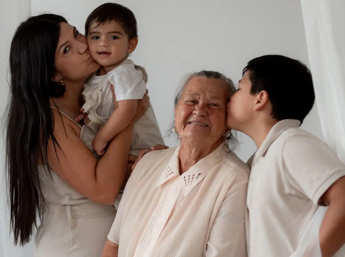
The photography shows children and parents in close, warm, candid shots with soft backgrounds. A toddler absorbed in a toy is more convincing than a staged group. A real church should photograph its own nursery and classrooms, with parent permission.
Accessibility
Navy text on cream is about 13.5 to 1. Orange buttons with white text measure only about 3.7 to 1, so button labels are large and bold, but a real site should darken the orange or switch to navy labels for small text. A theme toggle is in the header.
Type system
- DisplayBricolage GrotesqueBricolage Grotesque is friendly and a little irregular, which suits a church that wants noise and sippy cups to feel normal.
- TextNunitoNunito's rounded letterforms keep paragraphs soft and approachable for tired parents reading on a phone.
Colour and contrast
Each text pairing is checked against WCAG 2.2 in both themes. Ratios are computed from the exact theme colours.