Why Nightwatch looks the way it does
Nightwatch is designed to be read in the dark. It opens in its dark theme, with candle-amber type on a blue-black ground, because most of the people looking at it are checking a watch slot at 11 PM or deciding whether to drive over at 2 AM. The page is quiet, slow and spacious on purpose.
- Built for
- People in Kansas City who pray, or want to: weekly watch-keepers, worship musicians, night-shift workers looking for somewhere to go, and anyone sending a request at a hard hour.
- Navigation
- Full-screen menu. Only a Menu button shows; it opens a full-screen index with large type. Keeps the first screen uncluttered.
- Pages
- Home, Visit the room, Take an hour, Worship sets, Send a request, Our story
- Hero
- A single verse or sentence set enormous as the opening statement, with its reference, a short supporting line and one action. Variants: a = the quote fills the width with a hanging quotation mark; b = the quote beside a tall photograph; c = the reference becomes the architecture, with the book name and a giant outlined chapter and verse in the left column
Typography
Marcellus is drawn from Roman inscriptional capitals, the letters carved over doorways and on old bank fronts like the one Nightwatch meets in. Set large and alone, a single verse in Marcellus feels permanent. Alegreya Sans carries the reading at 18 pixels; its pen-shaped strokes keep a family resemblance with the display face without competing.
Color
The palette is the room itself after midnight: a blue-black like the windows on Troost, the beeswax amber of the candles on the long table, and a pale pre-dawn blue for links and details. The light theme is the same room at 6 AM, cool slate with a deeper amber, and it was chosen separately rather than flipped.
Layout and navigation
A full-screen menu keeps the first screen empty apart from the verse and one action. There are only six pages and people come back to the same two (take an hour, send a request), so a large, calm index works better than a busy header bar.
The hero
Isaiah 62:6 is the reason the house exists, so it is the first and largest thing on the site, with a hanging quotation mark and nothing else competing. The line beneath says plainly that the room is open now, which is the fact people most need at night.
Calls to action
Take an hour is the one action that keeps the room full, so it is in the corner of every page. The others are concrete: Send a prayer request, Come to the room. Buttons are set as underlined words in Marcellus, closer to a sign on a door than a button on an app.
Photography
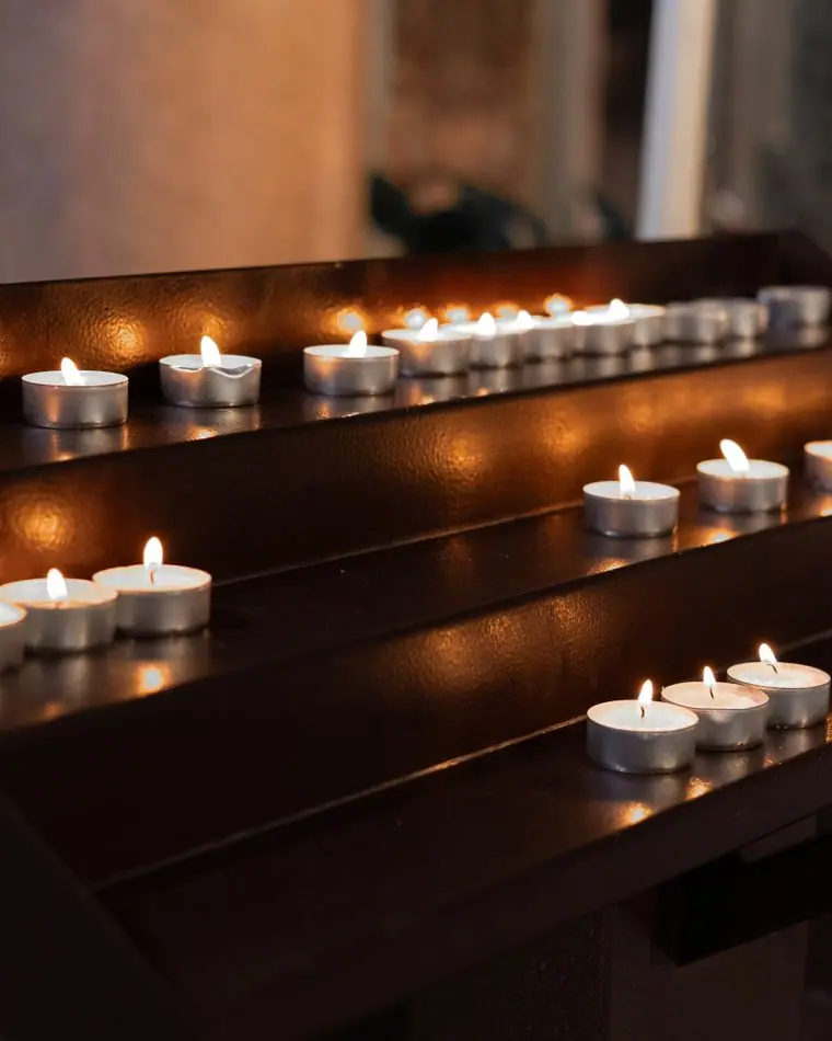
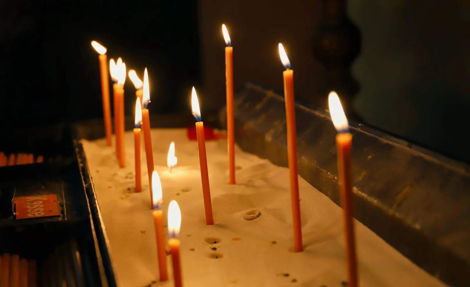
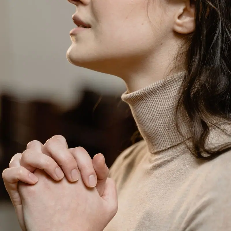
Low light, small numbers of people, candles and hands. We avoided arena worship photos with stage rigs because the room holds forty people at most and usually has six.
Accessibility
Body text is 18 pixels with a long line height, and amber on blue-black passes AA comfortably at body size. The room's access details (step-free door, the night bell, the quiet hours) are written out in full on the visit page, and every form label is visible rather than a placeholder.
Type system
- DisplayMarcellusA flared Roman modelled on carved inscriptions: it has the gravity of words cut into a lintel, but its soft terminals keep it from feeling cold at three in the morning.
- TextAlegreya SansA humanist sans with a calligraphic pulse that echoes Marcellus, and it stays comfortable on a dim phone screen in a dark room.
Colour and contrast
Every text pairing is checked against WCAG 2.2 in both themes.
Dark theme
| Pairing | Sample | Ratio | WCAG |
|---|
| Body text on page | Aa | 14.77:1 | AAA |
| Body text on cards | Aa | 13.42:1 | AAA |
| Secondary text | Aa | 6.52:1 | AA |
| Links | Aa | 9.1:1 | AAA |
| Button text | Aa | 9.2:1 | AAA |
| Accent label text | Aa | 8.03:1 | AAA |
| Text on dark bands | Aa | 15.53:1 | AAA |
| Muted text on dark bands | Aa | 7.82:1 | AAA |
| Text on brand bands | Aa | 9.2:1 | AAA |
| Muted text on brand bands | Aa | 5.53:1 | AA |
Light theme
| Pairing | Sample | Ratio | WCAG |
|---|
| Body text on page | Aa | 14.82:1 | AAA |
| Body text on cards | Aa | 16.64:1 | AAA |
| Secondary text | Aa | 5.54:1 | AA |
| Links | Aa | 5.49:1 | AA |
| Button text | Aa | 6.18:1 | AA |
| Accent label text | Aa | 7.3:1 | AAA |
| Text on dark bands | Aa | 14.82:1 | AAA |
| Muted text on dark bands | Aa | 7.82:1 | AAA |
| Text on brand bands | Aa | 6.18:1 | AA |
| Muted text on brand bands | Aa | 4.64:1 | AA |