 SeriesShopper Stories
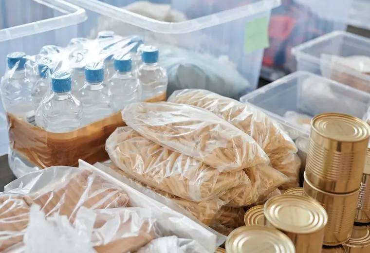 SeriesFood Rescue Notes
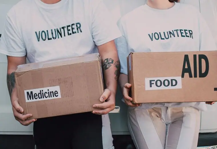 SeriesVolunteer Spotlights
Nov10
Grocery Store Food Drive
3:00 PM · Fresh Market on Lagrange
Shoppers donate bags of staples at the checkout.
Open Tuesdays and Saturdays. Walk in, grab a cart and take what your family needs. No forms, no lines out the door, no judgment.
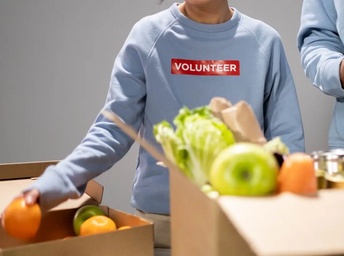
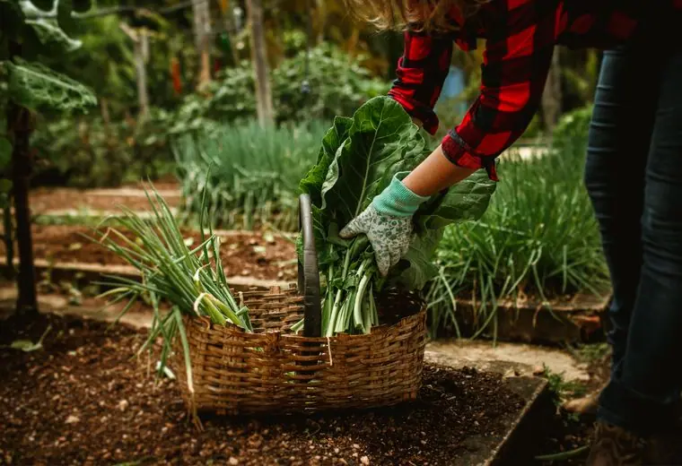
We set up our shelves like a neighborhood grocery store, with fresh produce, bread, dairy and the staples you actually cook with. Take what you need, come back when you need more. That is the whole deal.
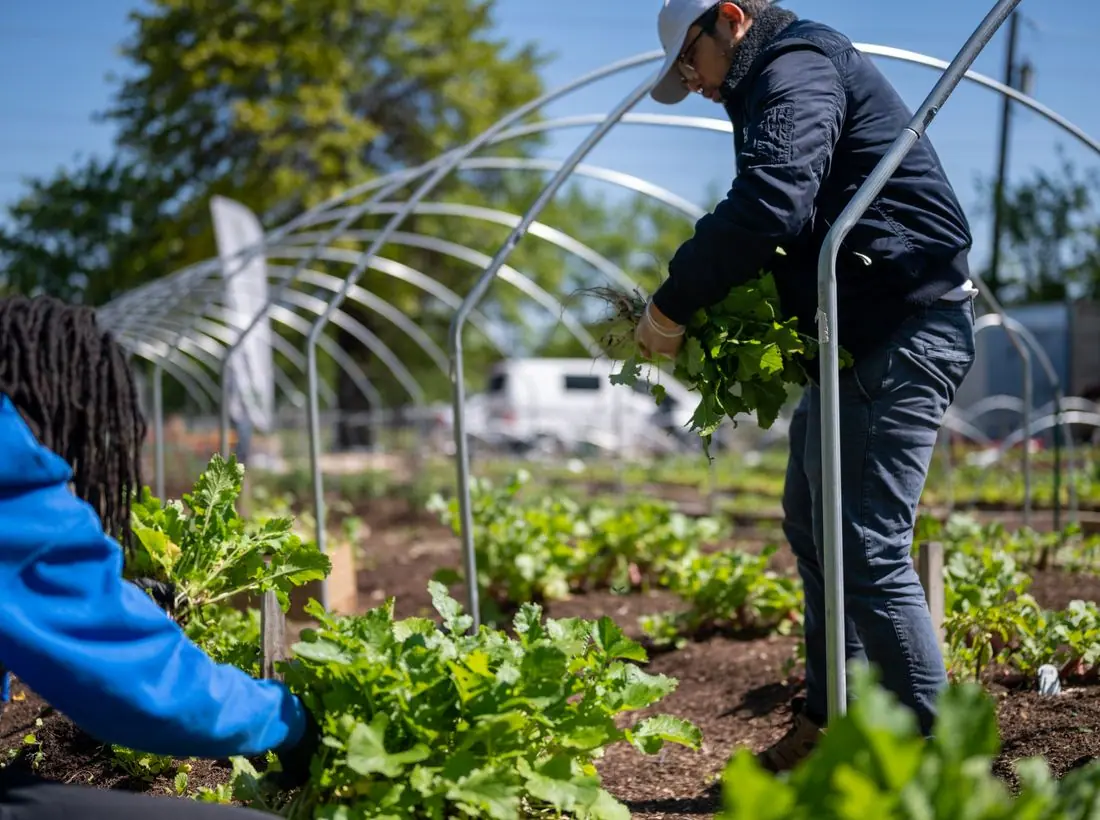
Half of what leaves our doors is produce, dairy or protein. Local farms and grocers give us what they cannot sell, and we get it to your table the same week.
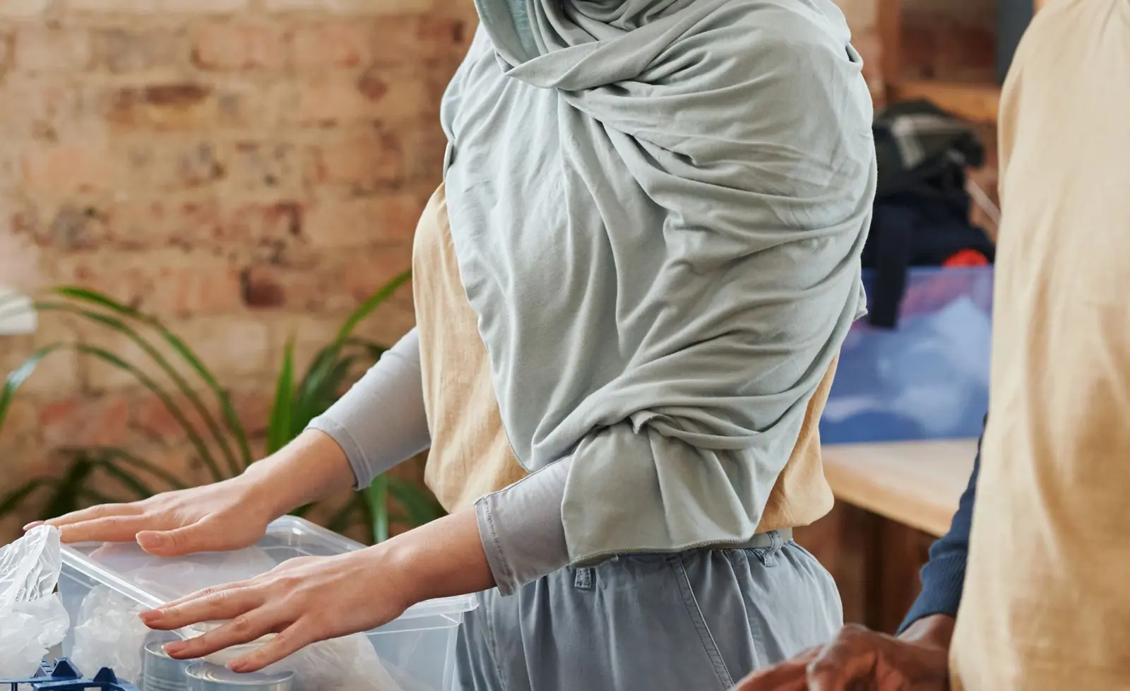
I used to skip dinner so the kids could eat. Now I leave with a full cart and a hello from someone who knows my name.Tasha, Tuesday regular
Shoppers donate bags of staples at the checkout.
Learn the system and sign up for a shift.
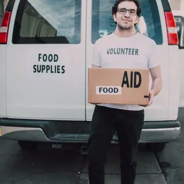
Bring a dozen, take a dozen and give a dollar.
Canned goods, cash or an hour of your time all end up on the same table.
Design notes
Neighborhood Pantry is a food bank site in mustard and deep teal, with a split hero, a large friendly headline and a stats band for pounds, households and volunteers. It tells a hungry visitor when to come, and tells donors what their food does.
Bricolage Grotesque at extra bold sets the headline at about 90 pixels. It has a slightly rough, human character that feels hand-lettered. Karla provides body text and is plain and compact. Together they read as a community notice board.
The page is warm mustard cream (#FFF5D6) with deep teal text (#0F3B3A), a teal brand colour (#0F5E5C) and a bright mustard (#E2A610) accent. The hero sits on a sage tint. The dark theme uses a lighter gold (#F2C14E). Teal and mustard are earthy, and the pairing looks like pantry shelves and tins.
A rounded white pill nav has a teal logo tile, six links and a teal Give Food button. The page then moves through a stats band, rounded value cards and a map-like visit block. The labels are literal, including Get Food, so a person in need does not have to decode them.
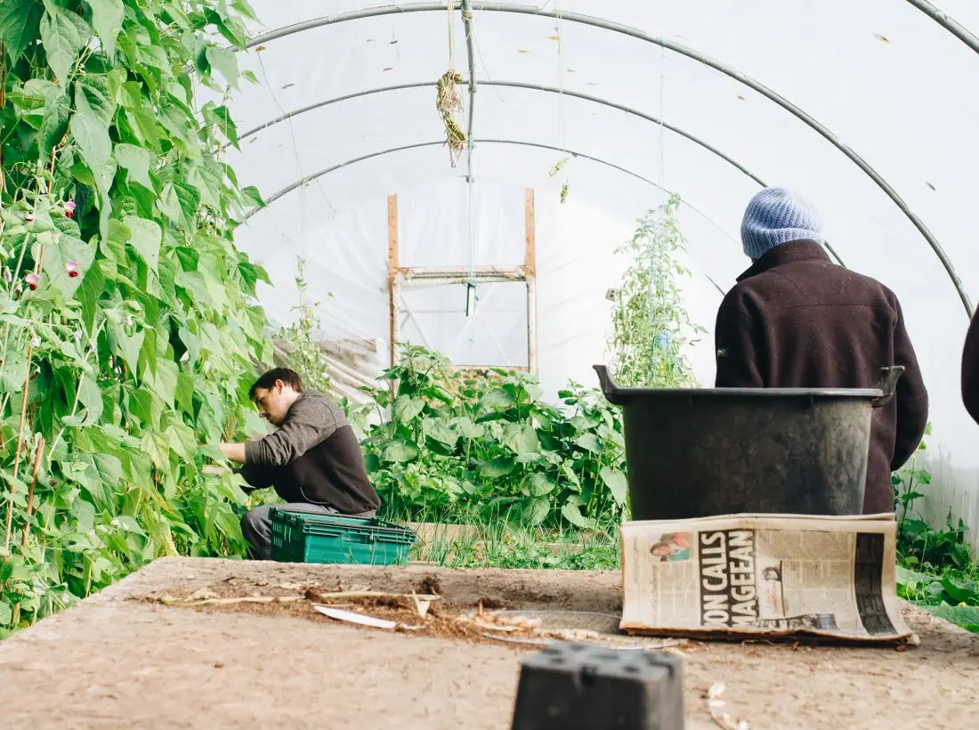
The hero is split. 'No neighbor goes hungry here.' is set on three lines at left, with a short line telling people to walk in, take a cart and take what their family needs. On the right is a tall photo of a breakfast table with a garden path photo overlapping. A chip names the next Saturday produce day.
'Visit the pantry' is the teal primary pill and 'Donate food' is outlined. The wording covers the two main audiences. Hours appear in the eyebrow, so the visitor sees them before reading anything else.
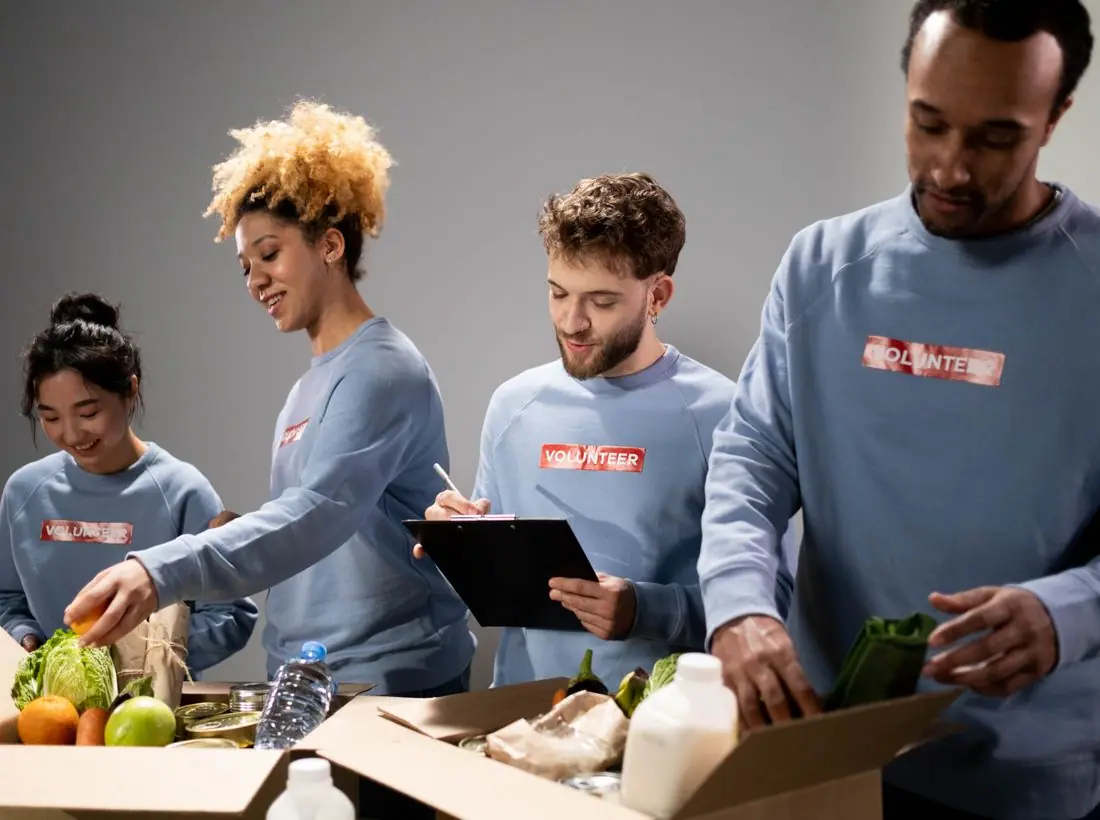
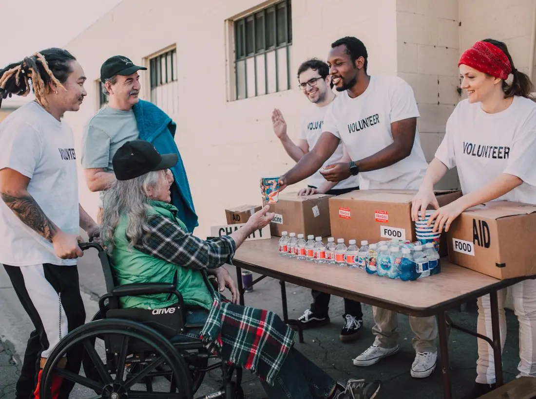
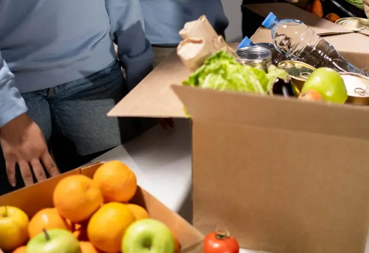
The food photograph is bright and abundant. It shows meals rather than shelves of cans, so the pantry looks generous. A real pantry should show its own distribution room and volunteers, and never photograph people receiving food without clear consent.
Teal text on mustard cream is about 11.3 to 1, and white on the teal button about 7.6 to 1. The message about no forms and no judgement is stated in plain words, which lowers the barrier to entry. The dark theme is available from the header.
Each text pairing is checked against WCAG 2.2 in both themes. Ratios are computed from the exact theme colours.
| Pairing | Sample | Ratio | WCAG |
|---|---|---|---|
| Body text on page | Aa | 11.30:1 | AAA |
| Body text on cards | Aa | 11.86:1 | AAA |
| Secondary text | Aa | 5.98:1 | AA |
| Secondary text on tinted bands | Aa | 4.82:1 | AA |
| Links and labels | Aa | 6.95:1 | AA |
| Button text | Aa | 7.57:1 | AAA |
| Accent button text | Aa | 9.09:1 | AAA |
| Footer text | Aa | 11.30:1 | AAA |
| Pairing | Sample | Ratio | WCAG |
|---|---|---|---|
| Body text on page | Aa | 14.17:1 | AAA |
| Body text on cards | Aa | 11.94:1 | AAA |
| Secondary text | Aa | 7.56:1 | AAA |
| Secondary text on tinted bands | Aa | 5.59:1 | AA |
| Links and labels | Aa | 9.49:1 | AAA |
| Button text | Aa | 11.73:1 | AAA |
| Accent button text | Aa | 9.64:1 | AAA |
| Footer text | Aa | 14.17:1 | AAA |
Designed by Greater Purpose Web. Names, people, photos and events are sample content.