Why Mercy Mile looks the way it does
Mercy Mile is a mobile food ministry site in a bold brutalist style. It has a black hero with diagonal stripes, a tilted food photo, huge uppercase type and a butter yellow header.
- Built for
- People looking for a free hot meal today, volunteers, and donors who want a direct and honest ministry.
- Navigation
- Sticky frosted bar with the full menu and a Give button. On phones, a bottom tab bar plus a quick-links launcher.
- Pages
- Home, About, Visit, Schedule, Stories, Events, Give, Contact
- Hero
- Poster-style block in the brand colour with oversized type beside a photo.
Typography
Archivo Black sets uppercase headlines in a wide, heavy form that looks like a sign painted on a truck. Work Sans carries the body text and is simple and readable. The headline is meant to be seen from across a parking lot, and the body keeps information plain.
Colour
The page uses butter yellow (#FFF6BF), black (#101010) and a traffic-light red (#D42E1A). The dark theme is black with a stronger yellow (#FFE94D). Yellow, black and red are the colours of road signs and food trucks, which is exactly the setting.
Layout and navigation
A butter-yellow header holds a black circle monogram, the full name in capitals, six links and a black Give button. Below is a black hero with fine diagonal stripes, then a strip of tiles for stops and schedule. Outlined cards with square corners keep the look rough and direct.
The hero
The hero reads 'HUNGRY? WE'RE ON THE WAY.' in white capitals on three lines, with a tilted breakfast photo in a white frame on the right. The framing feels like a Polaroid taped to a wall. A chip shows the next stop and a countdown.
Calls to action
'Find the truck' is a red button, with 'Volunteer' as an outlined button. The label answers a hungry person's immediate need. The red button is the only strong colour in the hero, so it is hard to miss.
Photography
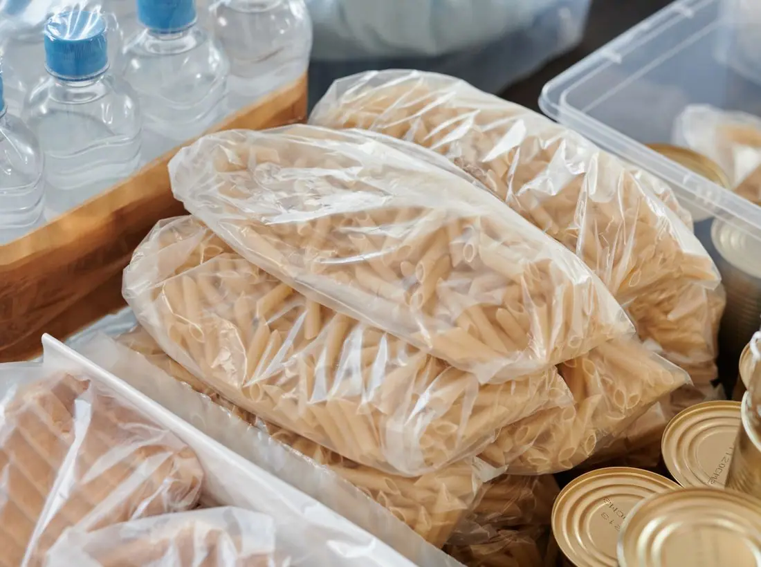
The photo is overhead food, bright and colourful against the black. It shows what is on offer, which is better than an image of the truck for a hungry visitor. A real ministry should show its own meals and its volunteers, and never recipients' faces without consent.
Accessibility
White on black measures about 19 to 1, the highest of any template. The red button carries white text. Text is plain and short, and the schedule is in text rather than an image so it can be read by screen readers.
Type system
- DisplayArchivo BlackArchivo Black is wide and loud, like lettering on the side of a truck.
- TextWork SansWork Sans is clear and neutral, which keeps the schedule readable beside such heavy type.
Colour and contrast
Each text pairing is checked against WCAG 2.2 in both themes. Ratios are computed from the exact theme colours.