Why Market Day looks the way it does
A site for a small community lender that makes loans to women most banks turn away. It talks about money plainly, puts the actual rate and fees on the first screen, and keeps the borrowers and their businesses at the center. Donors get one page of their own, near the end of the menu.
- Built for
- Women in Wake County running or starting small businesses: braiders, home bakers, caterers, cleaners, farmers market growers and in-home daycares. Also local lenders and donors.
- Navigation
- Centred masthead. The name sits centred like a printed masthead; pages run underneath. Signals heritage and calm.
- Pages
- Home, Borrow, Lending circles, Market Day, Back a borrower, Borrowers
- Hero
- An asymmetric mosaic of five photographs with the headline locked into one cell of the grid, so the first screen shows real people before it says anything. Variants: a = headline block top-left beside one large photo, three smaller below; b = a tall photo leads and the headline sits low on the right; c = a triptych, with the headline in the middle panel between stacked photos; A big headline with a slow, pausable line of words running across the page (real needs, or things people say), plus one photograph; the line stands still for visitors who prefer reduced motion. Variants: a = headline beside a portrait photo, with the moving line underneath; b = headline first, then the moving line set huge, then a wide photo beside the intro; c = headline and intro side by side over a full-width photo with the moving line laid along its lower edge
Typography
Yeseva One gives the headings the confidence of hand-painted shop lettering, which suits a lender whose clients run the shops. Mulish handles everything else because interest rates, terms and fees have to be impossible to misread.
Color
The plum is a muscadine grape, North Carolina's own, and the orange is a sweet potato from the fields east of Raleigh. Both sit on a blush-white ground with a warm pink bias. The dark theme lightens the plum to a soft orchid so it reads at night without glare.
Layout and navigation
A centered masthead with the pages underneath is closer to the painted sign over a market stall than to a bank's login portal. There is one button beside the pages, and it's the one a borrower needs: ask about a loan. Borrowers come before Back a borrower in the menu on purpose.
The hero
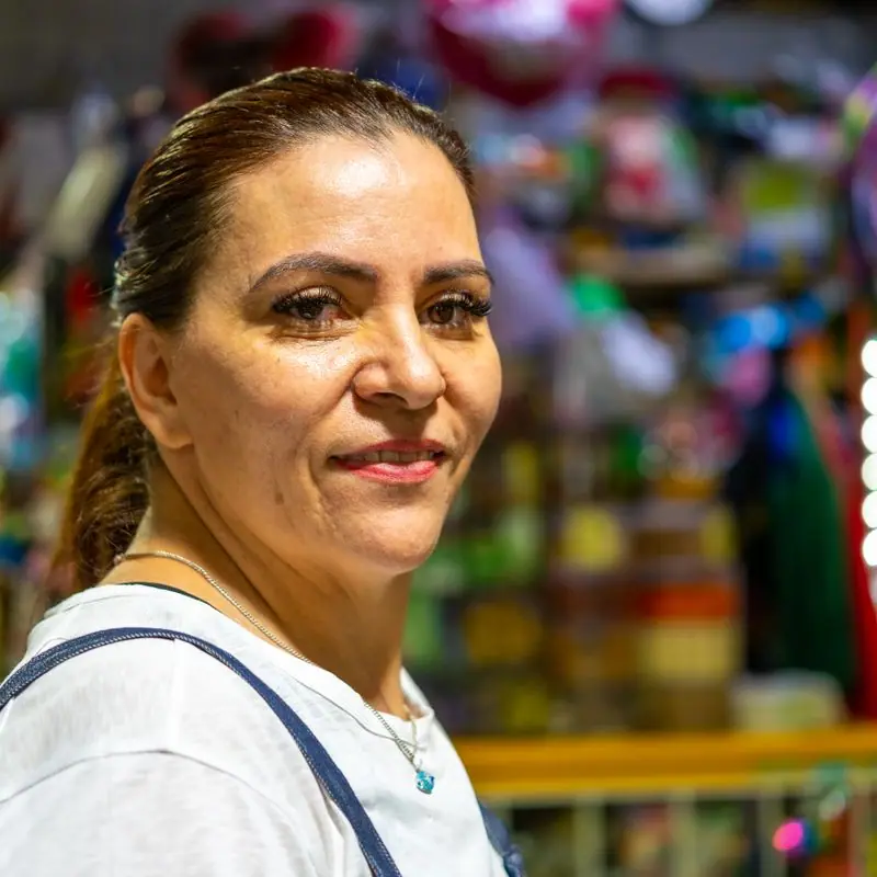
A borrower's portrait sits beside the headline, and underneath it a slow line lists what recent loans paid for: a chest freezer for tamales, a braiding chair, a commercial mixer. A woman can see her own business in that line before she reads a word of terms.
Calls to action
'Ask about a loan' leads, because the fear of being turned down is what stops most applicants, and asking commits you to nothing. 'Join a lending circle' comes next for women who aren't ready for a loan. Donors get 'Back a borrower', which keeps the borrower as the subject of the sentence.
Photography
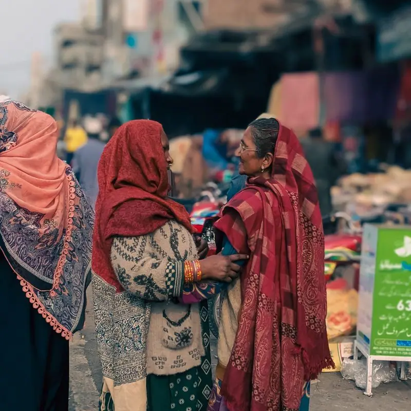
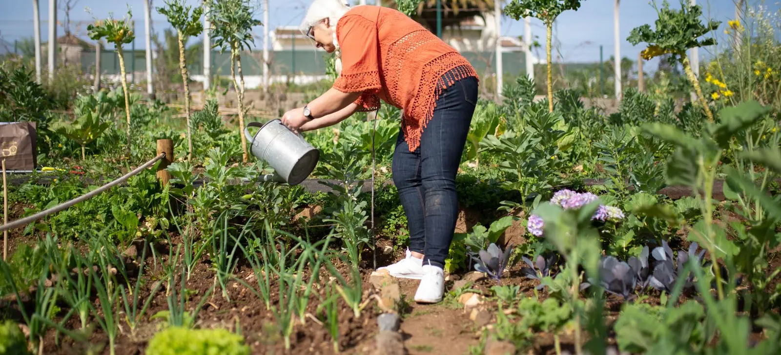
Women at work and at ease: a grower crouched in the radishes, a florist with an armful of stems, a group of friends on a sofa planning. Most are Black, Latina, West African and Southeast Asian women, which is who borrows here.
Accessibility
Loan terms are a real list with plain labels, not an image. The moving line pauses on hover and focus, has a pause button and stays still for anyone who prefers reduced motion. Every color pairing meets WCAG AA in both themes.
Type system
- DisplayYeseva OneYeseva One is a full, high-contrast serif with a confident swing to it, closer to a boutique's window lettering than to a bank's letterhead.
- TextMulishMulish is round and open, so loan terms and repayment tables feel plain-spoken rather than legal.
Colour and contrast
Every text pairing is checked against WCAG 2.2 in both themes.
Light theme
| Pairing | Sample | Ratio | WCAG |
|---|
| Body text on page | Aa | 15.44:1 | AAA |
| Body text on cards | Aa | 17.41:1 | AAA |
| Secondary text | Aa | 5.68:1 | AA |
| Links | Aa | 9.89:1 | AAA |
| Button text | Aa | 11.16:1 | AAA |
| Accent label text | Aa | 5.4:1 | AA |
| Text on dark bands | Aa | 15.44:1 | AAA |
| Muted text on dark bands | Aa | 8.1:1 | AAA |
| Text on brand bands | Aa | 11.16:1 | AAA |
| Muted text on brand bands | Aa | 7.01:1 | AAA |
Dark theme
| Pairing | Sample | Ratio | WCAG |
|---|
| Body text on page | Aa | 15.48:1 | AAA |
| Body text on cards | Aa | 14.1:1 | AAA |
| Secondary text | Aa | 6.88:1 | AA |
| Links | Aa | 8.31:1 | AAA |
| Button text | Aa | 8.54:1 | AAA |
| Accent label text | Aa | 8.29:1 | AAA |
| Text on dark bands | Aa | 16.44:1 | AAA |
| Muted text on dark bands | Aa | 8.23:1 | AAA |
| Text on brand bands | Aa | 8.54:1 | AAA |
| Muted text on brand bands | Aa | 5.27:1 | AA |
 Most chosen