Why St. Thomas Mar Thoma looks the way it does
A site for a Malayalam-speaking Mar Thoma parish whose members live all over the Metroplex and see each other in two places: the Sunday Qurbana on Plano Road and a living room on Friday night. The home page is the week itself, because the first thing a member checks is what's on, and the second-most-important page is a map of the prayer groups.
- Built for
- Kerala Christian families across Dallas–Fort Worth: founding-generation nurses and engineers, their American-raised children and grandchildren, and new families arriving on work visas from Kerala, the Gulf and other US cities.
- Navigation
- Slim icon rail. A narrow fixed rail with a vertical wordmark leaves the full width for photography and type.
- Pages
- This week, Holy Qurbana, Prayer groups, Children & youth, New families, Our parish, Offering
- Hero
- a short action form as the hero: the one thing most visitors came to do (request a ride, ask for help, register a child) can be done before they scroll, with reassurance beside it. Variants: a = headline, reassurance and a photo on the left with the form as a raised card on the right; b = a tall photo carrying the headline, with the form and reassurance on a plain panel beside it; c = headline beside a photo, then the form laid out as one horizontal booking bar; a drawn neighbourhood map as the opener, with numbered pins for each stop or campus and a list of names, addresses and times beside it; pointing at a list item lights up its pin. Built for mobile pantries, multi-site churches and bus routes. Variants: a = map on the left, headline and stop list on the right; b = headline across the top, a wide map, and the stops as columns beneath; c = a route: stops as a connected timeline beside a map with the path drawn between pins; This week's schedule is the hero: day columns with what is on, so regulars and newcomers see when to come before anything else
Typography
Yrsa was drawn by Rosetta as part of a multi-script project for Indian publishing, so its Latin was designed to sit beside Indic text. The body face is Anek Latin with Anek Malayalam for the translation, both from Ek Type in Mumbai, so a heading and its Malayalam line carry the same weight. The type ratio stays a modest 1.22 because grandparents read this site too.
Color
The green is the color of the backwaters and coconut palms in central Travancore, deepened until white text passes contrast on it. The brass accent comes from the nilavilakku, the standing oil lamp in every Kerala home and church. The double rules between sections are a nod to the gold border on a kasavu sari or mundu.
Layout and navigation
A slim icon rail keeps all seven pages in reach without a crowded header, and the labels switch to Malayalam with everything else. On phones it folds into a single menu button. Pages are named the way members talk about parish life: Qurbana, prayer groups, Sunday School, offering.
The hero
The home page opens with the week itself: seven columns from Sunday Qurbana to Saturday choir, with today highlighted and a countdown to the next gathering. For a parish where most people come to several things a week, that's more useful than any welcome photo.
Calls to action
The standing action is 'Transfer your membership', because new families arriving in Dallas want to belong properly, and the transfer letter is the step they're unsure about. The other actions are concrete: find your prayer group, enroll for Sunday School, your first Qurbana.
Photography
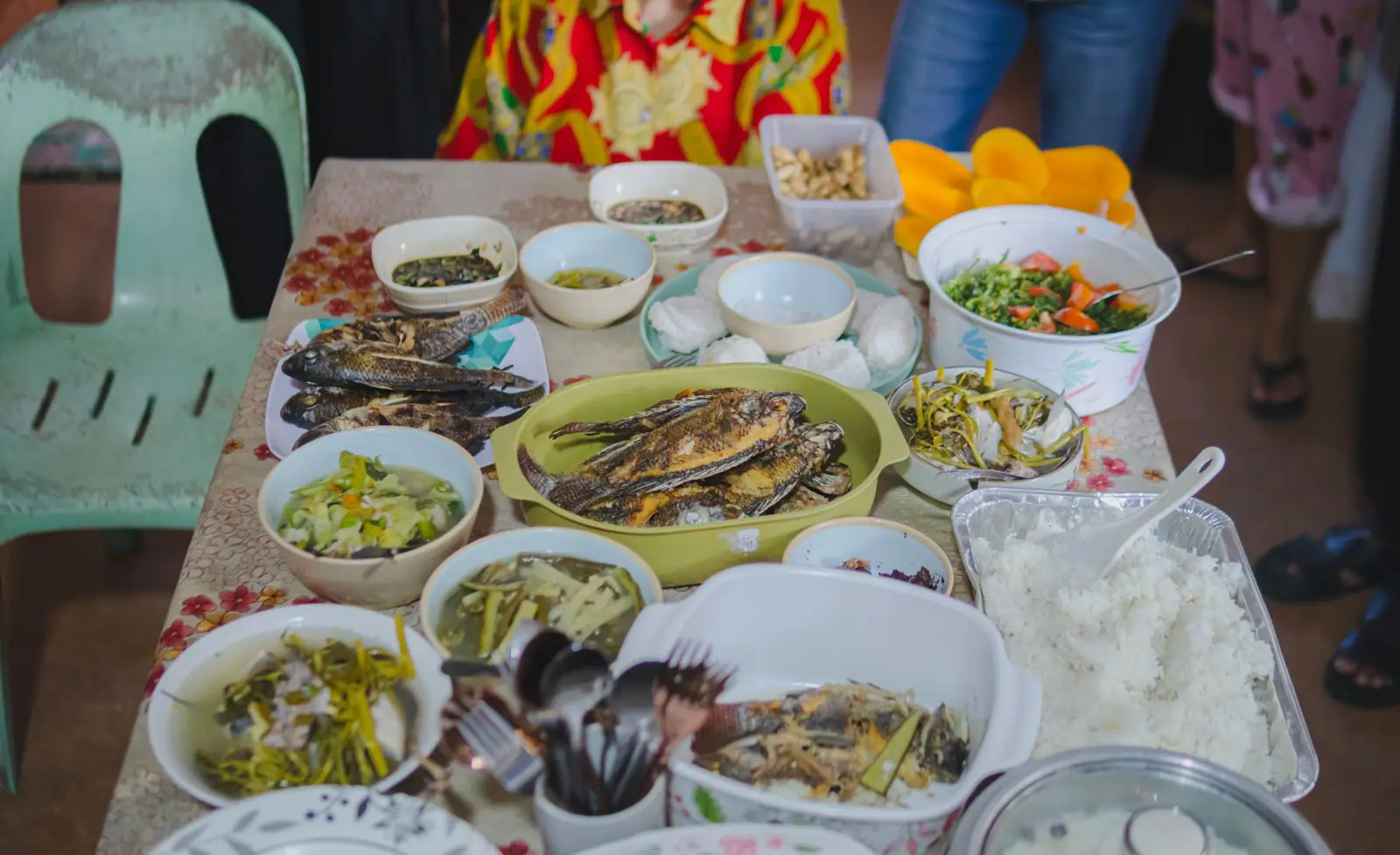
We used photographs of South Asian families, elders and young people wherever the library had them, and otherwise chose close-ups of the chalice, the lamps and the food that don't misrepresent who is in the room. There are no stock crowd shots of a different congregation.
Bilingual by design
Every heading, button, schedule entry and page name has a natural Malayalam version. Longer paragraphs stay in English, which is how the parish's own notices are written, so second-generation members aren't left out. The liturgy table explains exactly which Sundays are in which language.
Accessibility
Body text is 17px with generous leading, every color pairing passes WCAG AA in both themes, and the language switch sets the lang attribute so screen readers pronounce Malayalam correctly. The map page lists every group in plain text beside the drawing.
Type system
- DisplayYrsaYrsa came out of Rosetta's multi-script work for Indian publishing, so it was drawn to sit beside non-Latin text on the same line without shouting over it.
- TextAnek LatinAnek is a type family from Ek Type in Mumbai with a Malayalam sibling, so English and Malayalam lines share stroke weight and rhythm.
Colour and contrast
Every text pairing is checked against WCAG 2.2 in both themes.
Light theme
| Pairing | Sample | Ratio | WCAG |
|---|
| Body text on page | Aa | 14.81:1 | AAA |
| Body text on cards | Aa | 16.07:1 | AAA |
| Secondary text | Aa | 5.84:1 | AA |
| Links | Aa | 7.2:1 | AAA |
| Button text | Aa | 8.14:1 | AAA |
| Accent label text | Aa | 4.64:1 | AA |
| Text on dark bands | Aa | 14.81:1 | AAA |
| Muted text on dark bands | Aa | 7.86:1 | AAA |
| Text on brand bands | Aa | 8.14:1 | AAA |
| Muted text on brand bands | Aa | 5.39:1 | AA |
Dark theme
| Pairing | Sample | Ratio | WCAG |
|---|
| Body text on page | Aa | 15.43:1 | AAA |
| Body text on cards | Aa | 13.83:1 | AAA |
| Secondary text | Aa | 6.8:1 | AA |
| Links | Aa | 10.01:1 | AAA |
| Button text | Aa | 10.13:1 | AAA |
| Accent label text | Aa | 9.51:1 | AAA |
| Text on dark bands | Aa | 16.26:1 | AAA |
| Muted text on dark bands | Aa | 8.13:1 | AAA |
| Text on brand bands | Aa | 10.13:1 | AAA |
| Muted text on brand bands | Aa | 5.89:1 | AA |