 SeriesStill Here
 SeriesThe City Prayer
 SeriesLight Work
Nov14
Neighbor Day: Park Cleanup
9:00 AM · Goodale Park
Gloves and coffee are on us. Bring a friend and a rake.
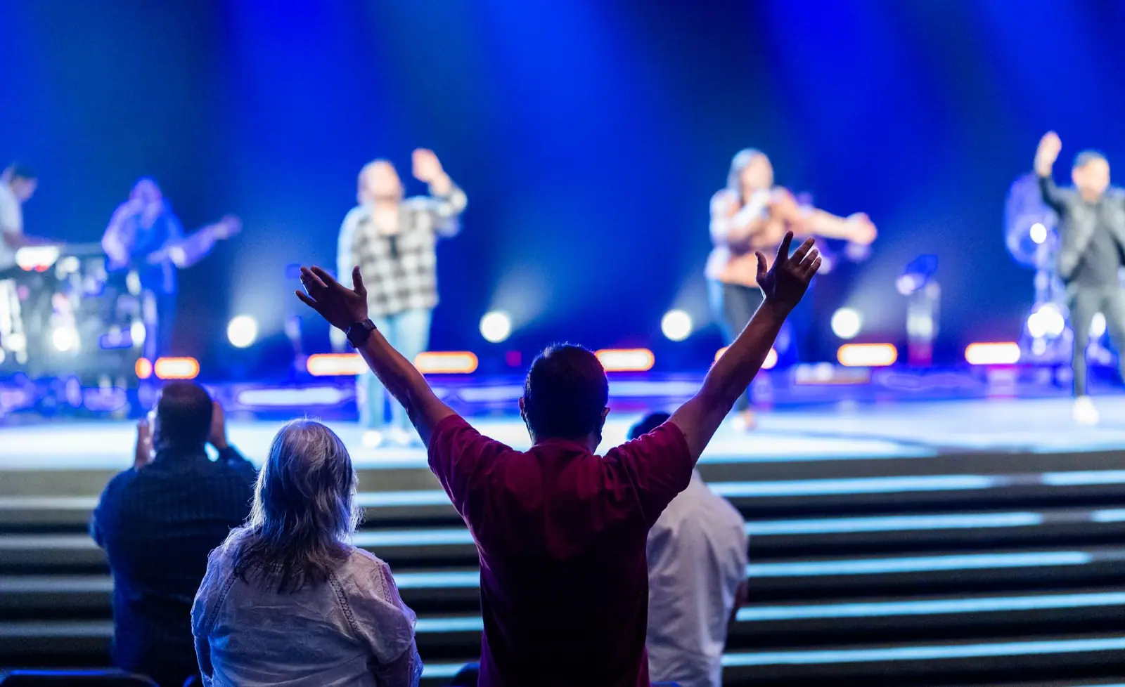
Live music, honest teaching and a room with space for you. Doors open Sundays at 10 on Gay Street.
Lumen is a church for people who love the city and are still figuring out faith. We sing loud, teach the Bible plainly and leave room for questions. You do not have to have it together to belong here.
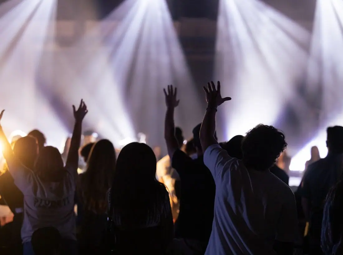
On the first Friday of every month we turn the lights down and the music up. An hour of songs, Scripture and open prayer, with no sermon and no agenda.
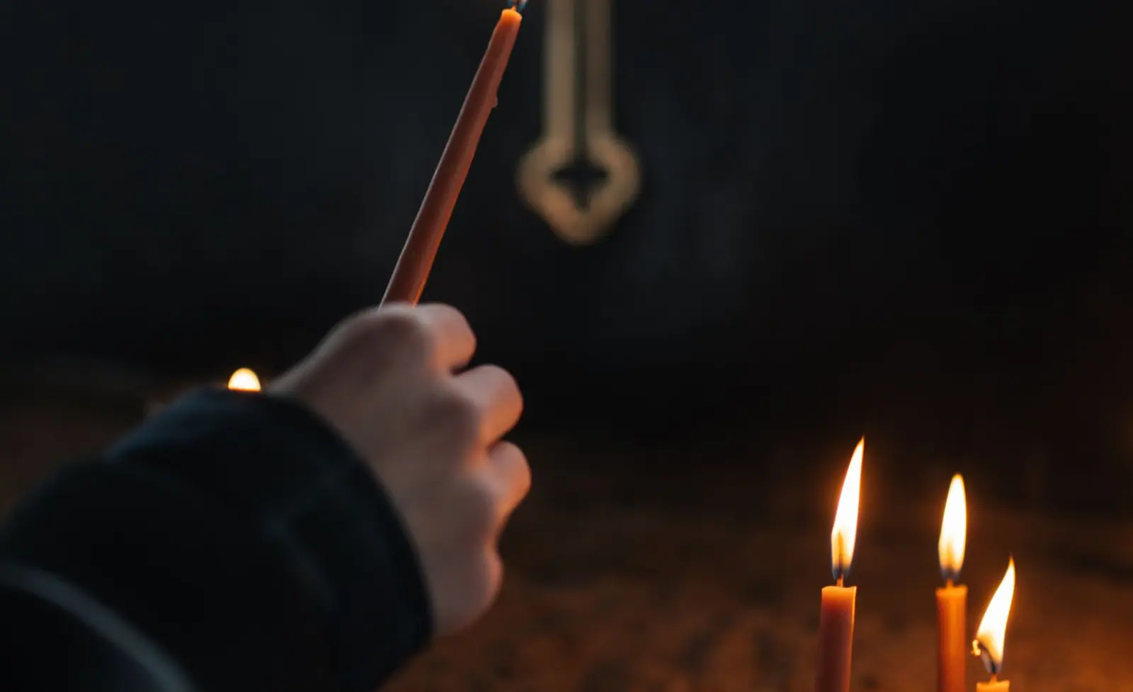
In him was life, and the life was the light of men.John 1:4 (WEB)
Gloves and coffee are on us. Bring a friend and a rake.
A Sunday of testimonies and thanksgiving, followed by a shared lunch.
Candles, carols and the story of the light coming into the world.
Your giving funds Sunday gatherings, groups and neighborhood projects.
Design notes
Lumen is a modern worship church site that opens on a dark photo of raised hands and a floating pill-shaped navigation bar. It uses a serif headline against a contemporary layout so the church feels current without losing warmth.
Fraunces at semibold sets the headlines. It is a soft, slightly wonky serif that looks editorial rather than churchy, and it holds up at the very large size used in the hero. Inter handles body copy, labels and the nav, which keeps small text sharp on dark photography.
The brand is a burnt amber (#A65709) on a warm off-white (#F6F2EA) page, with sage green (#3F6B58) as a quiet second colour. The site is set to open in its dark theme, near black (#0E0E0C) with a brighter amber (#E8A33D). Amber reads like stage light, which suits a church that centres its identity on live music.
The navigation is a white pill floating above the hero, with the Give button inside it as an amber pill. Content below is organised in tinted cards and a four-part strip for time, place, messages and first-time visitors. Everything stays in a single column of sections, so the page is quick to scan on a phone.
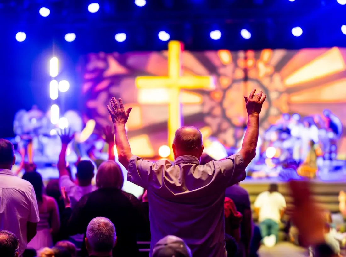
A full-bleed photo of worshippers with raised hands fills the first screen under a dark gradient. The headline 'Bring your whole self to worship.' runs across two lines at roughly 90 pixels. The eyebrow above it gives the neighbourhood and the Sunday time, which answers the first two questions a visitor has.
'Join us Sunday' is a solid amber pill and 'Live stream' is an outlined pill beside it, so the in-person visit is the clear first choice. The event chip under the buttons counts down to the next Night of Worship. Give stays visible in the top bar throughout.
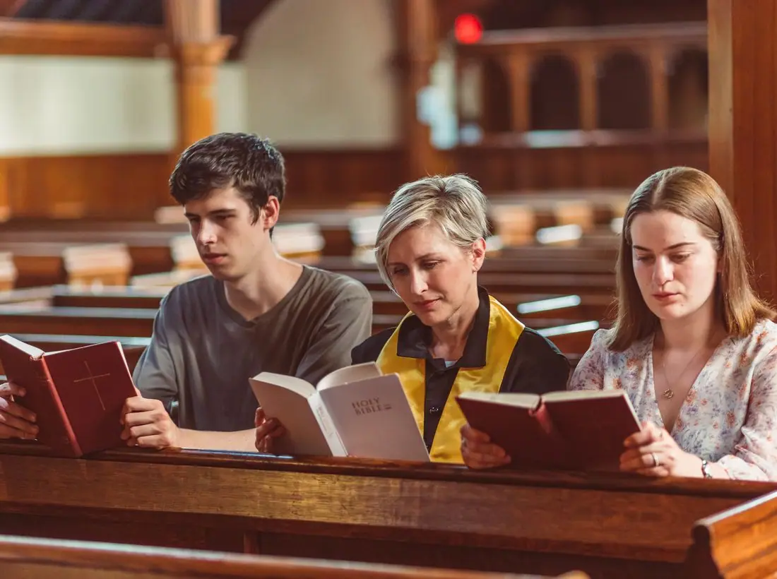
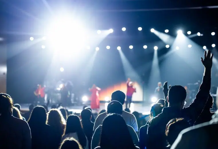
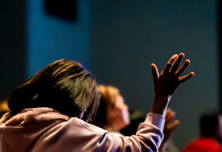
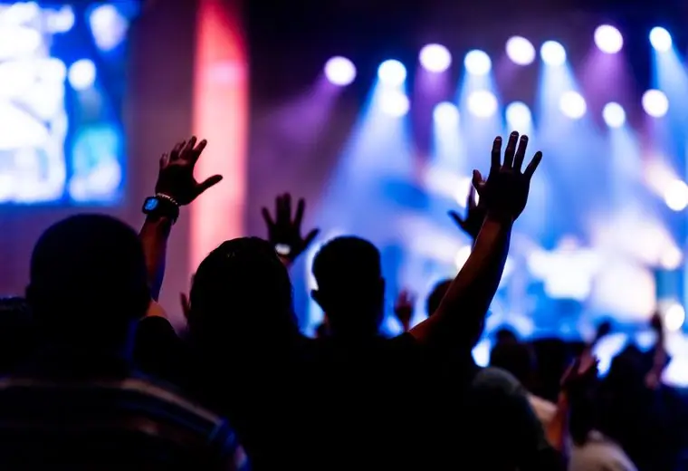
The pictures are dark, grainy concert-style shots of hands and stage light. They tell a visitor what the room feels like. Faces are rarely shown, which protects privacy but means a real build should add a few clear portraits of staff so visitors know who will greet them.
Text is white or warm cream on a heavily darkened photo, and the dark theme's body pair measures about 17 to 1. White text on the amber button is about 5.3 to 1, which passes for normal-size text. The theme toggle in the pill nav lets visitors switch to a light page.
Each text pairing is checked against WCAG 2.2 in both themes. Ratios are computed from the exact theme colours.
| Pairing | Sample | Ratio | WCAG |
|---|---|---|---|
| Body text on page | Aa | 17.13:1 | AAA |
| Body text on cards | Aa | 15.46:1 | AAA |
| Secondary text | Aa | 8.61:1 | AAA |
| Secondary text on tinted bands | Aa | 6.87:1 | AA |
| Links and labels | Aa | 8.96:1 | AAA |
| Button text | Aa | 9.13:1 | AAA |
| Accent button text | Aa | 8.71:1 | AAA |
| Footer text | Aa | 17.13:1 | AAA |
| Pairing | Sample | Ratio | WCAG |
|---|---|---|---|
| Body text on page | Aa | 16.65:1 | AAA |
| Body text on cards | Aa | 18.59:1 | AAA |
| Secondary text | Aa | 6.56:1 | AA |
| Secondary text on tinted bands | Aa | 5.45:1 | AA |
| Links and labels | Aa | 5.56:1 | AA |
| Button text | Aa | 5.26:1 | AA |
| Accent button text | Aa | 6.08:1 | AA |
| Footer text | Aa | 16.65:1 | AAA |
Designed by Greater Purpose Web. Names, people, photos and events are sample content.