Why Little Lights looks the way it does
Little Lights is a children's ministry site with a pale yellow page, a heavy rounded headline and bright pill buttons. It is made for parents, and it feels friendly to a child looking over a shoulder.
- Built for
- Parents of children from birth to age 11, and the volunteers who teach them.
- Navigation
- Floating rounded pill that sits over the hero photo. On phones, a bottom tab bar plus a quick-links launcher.
- Pages
- Home, About, Visit, Classes, Stories, Events, Give, Contact
- Hero
- Centred headline over a three-photo collage.
Typography
Nunito Extra Bold sets headlines and Nunito also sets the body. The round terminals feel safe and friendly, and using one family stops the page looking busy. Headlines are large and spaced so a parent can read them while holding a toddler.
Colour
The page is soft cream-yellow (#FFFBEA) with deep indigo text (#2B2350), a golden yellow (#FFB400) for buttons and pink (#E8478B) for small accents. The dark theme turns the background into a night-sky purple. Yellow and indigo are strongly contrasting, so the buttons are easy to see.
Layout and navigation
A white rounded bar has a yellow circle logo, the name, six links and a yellow Give button. A big pale yellow circle sits behind the headline as decoration. Below, three photos appear at different heights, then cards for classes by age.
The hero
The hero is centred, with the headline 'Where little ones learn they are loved.' at about 90 pixels and a short description of Sunday school, story time and play. The eyebrow gives ages and the time. A chip tells parents when kids' classes start next.
Calls to action
'Register your child' is a yellow pill with dark text, followed by 'Meet the team' as an outlined pill. Registration comes first because parents want to know it is safe and organised. Meeting the team builds trust for the cautious.
Photography
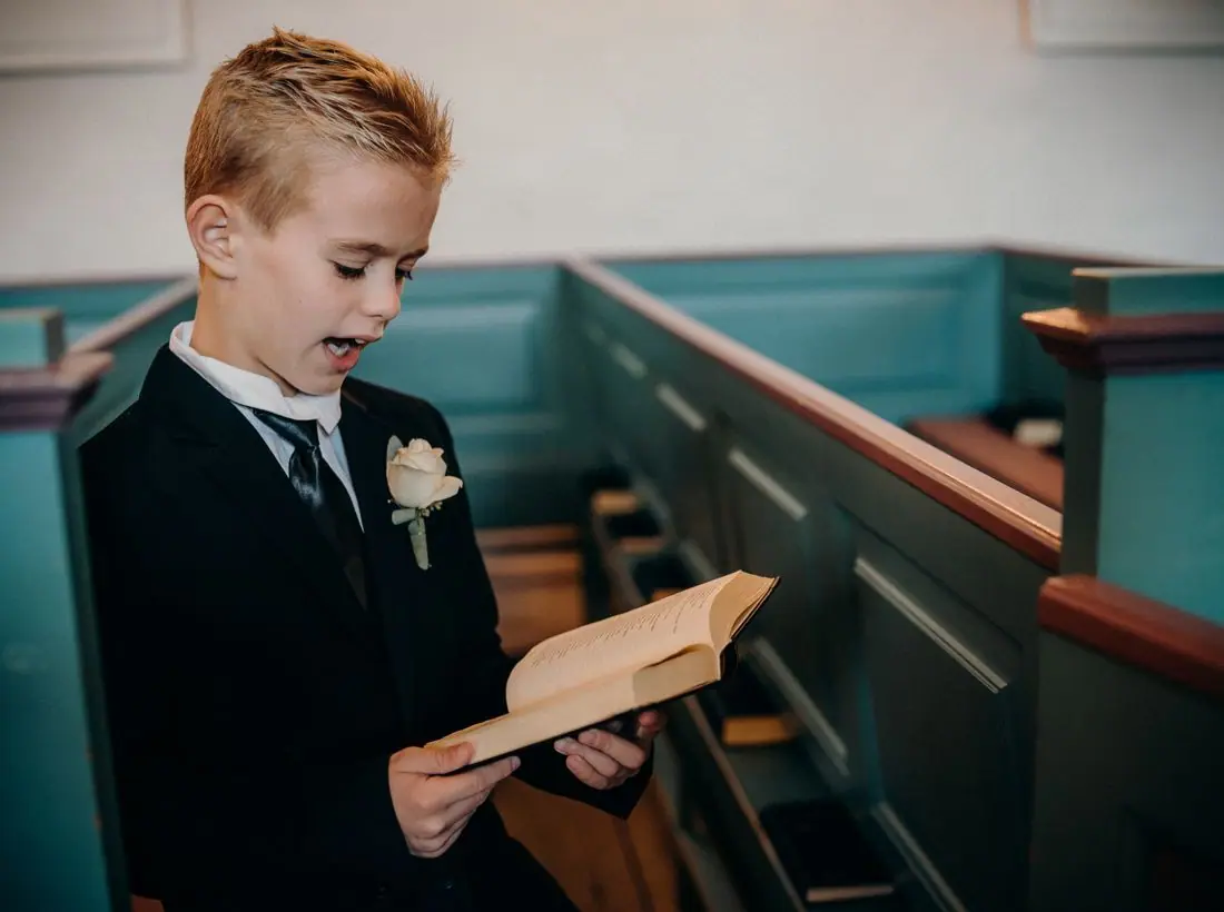
The images are close shots of children and adults in bright colours. A real children's ministry must get written permission for every child photographed, and many choose illustrations or backs of heads for public pages.
Accessibility
Indigo text on cream is about 14 to 1. The yellow button uses dark text and not white, because white on yellow would measure only about 1.8 to 1. Buttons are big, and the page does not rely on colour alone to identify links.
Type system
- DisplayNunitoNunito Extra Bold is round and warm, so the biggest words on the page feel like a hug.
- TextNunitoUsing Nunito for the body keeps the voice consistent and keeps small text soft and clear.
Colour and contrast
Each text pairing is checked against WCAG 2.2 in both themes. Ratios are computed from the exact theme colours.