Why Little Larder looks the way it does
A network of seven free fridges on Detroit and Hamtramck corners, run by volunteers and the businesses that host them. The site does one job first: show the nearest fridge and how to use it without shame. Everything else, stocking, cleaning and hosting, comes after.
- Built for
- Anyone who needs food tonight, neighbors with extra groceries or garden produce, volunteers who keep the fridges clean, and shop owners thinking about hosting one.
- Navigation
- Corner controls. Name in one corner, menu in the opposite corner, primary action in a third. The page itself has no header bar.
- Pages
- Find a fridge, Take what you need, Stock a fridge, Fridge check, Host a fridge, Who we are
- Hero
- a short action form as the hero: the one thing most visitors came to do (request a ride, ask for help, register a child) can be done before they scroll, with reassurance beside it. Variants: a = headline, reassurance and a photo on the left with the form as a raised card on the right; b = a tall photo carrying the headline, with the form and reassurance on a plain panel beside it; c = headline beside a photo, then the form laid out as one horizontal booking bar; a drawn neighbourhood map as the opener, with numbered pins for each stop or campus and a list of names, addresses and times beside it; pointing at a list item lights up its pin. Built for mobile pantries, multi-site churches and bus routes. Variants: a = map on the left, headline and stop list on the right; b = headline across the top, a wide map, and the stops as columns beneath; c = a route: stops as a connected timeline beside a map with the path drawn between pins
Typography
Every fridge in the network is labeled by hand in marker, so the headings are set in Permanent Marker; the site looks like the doors. Body text is Bricolage Grotesque, a sturdy grotesque with a little ink-trap grit that stays readable on a cracked phone screen. Courier Prime sets the labels and dates, like the label-maker tape on every container.
Color
The palette is a fridge door: enamel white, tomato red from the painted murals on the Vernor and Kercheval fridges, and masking-tape yellow. The neutrals lean very slightly green, like old appliance enamel. In the dark theme the page becomes the fridge at night, near-black with the red warmed so it still passes contrast.
Layout and navigation
There is no header bar. The name sits in one corner, the menu in another and Find a fridge in a third, so the map gets the whole first screen. People reach this site from a QR sticker on a fridge door, often at night, and the fewer things between them and the map the better.
The hero
The opener is the map: seven numbered fridges with addresses and what's special about each, and pointing at a name lights up its pin. A headline about generosity would be a worse first screen for someone hungry at 11 PM than an address two blocks away.
Calls to action
Find a fridge is the one fixed action. Further down, the wording is plain and specific: Stock a fridge, Take a fridge-check shift, Host a fridge. Nothing asks anyone to register, qualify or explain themselves, because the fridges don't.
Photography
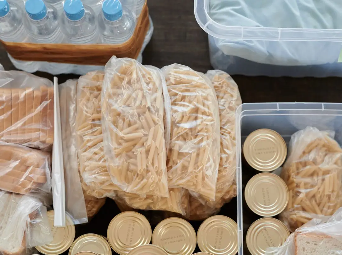
Real food in real containers: produce boxes, bread crates and a volunteer stocking greens. No posed handshake photos and no pictures of people receiving food, which the network's guests asked us not to show. Notes left on the fridge doors stand in for testimonials.
Accessibility
High-contrast text, big tap targets on the map list, and every fridge marked for step-free access or not. The take-what-you-need page is written at a sixth-grade reading level and says up front that no ID, address or reason is ever needed.
Type system
- DisplayPermanent MarkerEvery fridge door in the network is labeled by hand in marker, so the headlines are too.
- TextBricolage GrotesqueA grotesque with a bit of ink-trap grit; friendly, sturdy and very readable on a cracked phone screen.
- AccentCourier PrimeLabels and dates set like the label-maker tape on every container in the fridges.
Colour and contrast
Every text pairing is checked against WCAG 2.2 in both themes.
Light theme
| Pairing | Sample | Ratio | WCAG |
|---|
| Body text on page | Aa | 15.95:1 | AAA |
| Body text on cards | Aa | 17.61:1 | AAA |
| Secondary text | Aa | 5.81:1 | AA |
| Links | Aa | 5.5:1 | AA |
| Button text | Aa | 5.92:1 | AA |
| Accent label text | Aa | 11.18:1 | AAA |
| Text on dark bands | Aa | 15.95:1 | AAA |
| Muted text on dark bands | Aa | 8.28:1 | AAA |
| Text on brand bands | Aa | 5.92:1 | AA |
| Muted text on brand bands | Aa | 4.63:1 | AA |
Dark theme
| Pairing | Sample | Ratio | WCAG |
|---|
| Body text on page | Aa | 16.02:1 | AAA |
| Body text on cards | Aa | 14.46:1 | AAA |
| Secondary text | Aa | 7.07:1 | AAA |
| Links | Aa | 7.14:1 | AAA |
| Button text | Aa | 7.43:1 | AAA |
| Accent label text | Aa | 12.86:1 | AAA |
| Text on dark bands | Aa | 17.08:1 | AAA |
| Muted text on dark bands | Aa | 8.58:1 | AAA |
| Text on brand bands | Aa | 7.43:1 | AAA |
| Muted text on brand bands | Aa | 4.88:1 | AA |