Why Hometown Arts looks the way it does
Hometown Arts is an arts council site with a bold red poster hero, a chunky retro serif headline and a tilted photo. It borrows from vintage show posters, so a gallery or class feels like an event.
- Built for
- Local artists, class students, event visitors and members of the arts council.
- Navigation
- Centred logo with the menu on a rule below, editorial style. On phones, a bottom tab bar plus a quick-links launcher.
- Pages
- Home, About, Visit, Classes, Stories, Events, Support, Contact
- Hero
- Poster-style block in the brand colour with oversized type beside a photo.
Typography
Playfair Display Black sets the headline at about 140 pixels, with high-contrast strokes and heavy fat letters that remind people of old theatre bills. Karla handles body text with a plain, warm grotesque. The headline is the star and the body keeps listings readable.
Colour
The page is cream (#F7EAD3) with dark brown text (#2B1B14), a brick red (#C0392B) hero and a teal (#2A7F8E) accent for buttons. The dark theme uses a coral (#F07C6C). Red, teal and cream are a classic screen-print combination, and they suit a community that likes handmade things.
Layout and navigation
A centred masthead with the logo and name sits above six links, with a Support button on the right. The hero is full red with fine diagonal lines. Below are outlined cards and a strip of upcoming events. The centred top suggests a theatre programme.
The hero
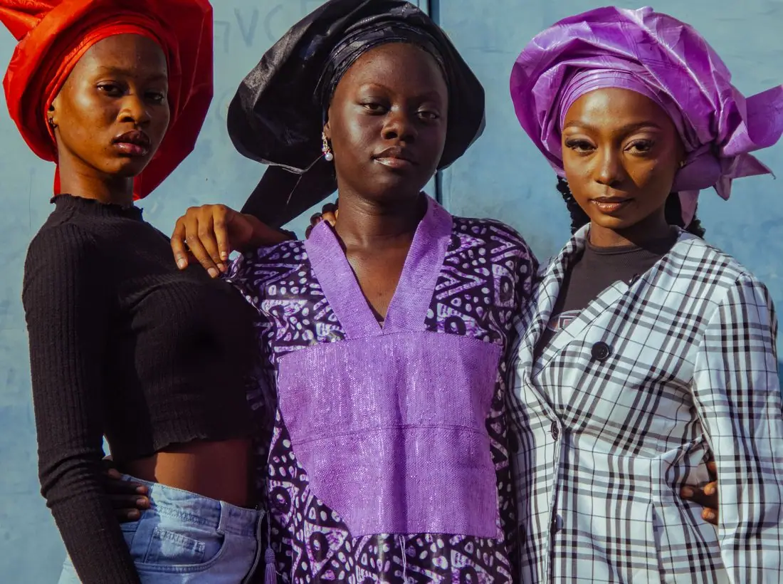
The hero is a poster. 'Make it. Show it. Share it.' fills three lines in white, with a tilted photo of two women laughing before a mural in a white frame on the right. The eyebrow reads 'Now showing at the old mill', which sets the arts-venue tone.
Calls to action
'See what's on' is a teal button, set against the red so it stands out, and 'Teach a class' is outlined. The first speaks to audiences, and the second to artists. Support is in the header.
Photography
The photo is bright and colourful, with a mural backdrop that shows the local art scene. A real council should photograph its own gallery openings and classes, and credit the artists whose work is shown.
Accessibility
White on the red hero is about 5.5 to 1 for the large headline, and dark brown on cream is about 14 to 1. The diagonal lines in the red section are faint. The teal button has white text at about 4.6 to 1 on the cream page, so button text is bold and sized up.
Type system
- DisplayPlayfair DisplayPlayfair Display Black has the chunky confidence of a vintage poster, and it makes a short phrase feel like a show title.
- TextKarlaKarla is friendly and easy to read, so class times and prices stay clear under the dramatic headline.
Colour and contrast
Each text pairing is checked against WCAG 2.2 in both themes. Ratios are computed from the exact theme colours.