Why Hearth Families looks the way it does
Hearth Families is a West Michigan ministry that surrounds foster and adoptive parents with a team of five or six trained neighbors from local churches. The site's job is to recruit those neighbors, while making sure an exhausted foster parent can find the Closet and the placement line in two taps.
- Built for
- Church members in Grand Rapids who are curious about foster care but not ready to license, plus current foster and adoptive parents who need practical help this week.
- Navigation
- Classic top bar. Logo left, pages right, one action. Familiar to every visitor.
- Pages
- Home, Care teams, Thinking of fostering, The Closet, For parents, Our story
- Hero
- A personal letter from the pastor or director as the opening: a greeting, two or three short paragraphs and a handwritten-style signature, with their portrait. Variants: a = the letter on a sheet with the portrait overlapping its left edge; b = an editor's-letter layout with a huge greeting, two text columns and a small captioned portrait; One impact number is the hero (for example meals served this year), with a line naming the unit, a sentence of context, a row of three supporting figures and one photograph. The number counts up once when it first comes into view. Variants: a = the number spans the full width above the photo and figures; b = photo on the left, number and a ledger of figures on the right; c = the number sits on a coloured panel that overlaps the bottom of a wide photograph
Typography
Rufina carries the headlines, old-style figures and all, so the big numbers sit like handwriting in a ledger. Its pointed serifs and calligraphic contrast feel like the inscription page of a family Bible, which is the right register for a ministry about who belongs to whom. Nunito Sans does the work underneath: rounded, open and calm at 17px, because many readers are on a phone in a hospital corridor or a caseworker's waiting room.
Color
The palette comes from Delft tiles, the blue-and-white tiles that lined fireplaces in the Dutch homes of Holland, Zeeland and Grand Rapids. Cobalt does the structural work, porcelain blue-white is the page, and a single ember orange marks the hearth: needs, highlights and the placement line. The dark theme moves to night-tile navy, with the cobalt softened so it doesn't buzz against the dark.
Layout and navigation
A classic top bar with six plain page names, because the two audiences arrive with very different questions and both need to see their door immediately. 'Thinking of fostering' and 'For parents' sit side by side so a curious church member and a licensed parent never wander into each other's pages.
The hero
The opening number is 86, the families who have a care team around them right now. We chose it over children served because the ask is for neighbors, and the number shows the ask working. The supporting ledger turns the abstract into casseroles, babysitting hours and churches.
Calls to action
The main button is 'Join a care team', since that is what the ministry most needs and the smallest real step most people can take. Fostering itself is approached through 'Come to a First Questions night', a no-commitment evening, because nobody licenses from a website. Parents get 'Ask for a care team', worded as a request they are entitled to make.
Photography
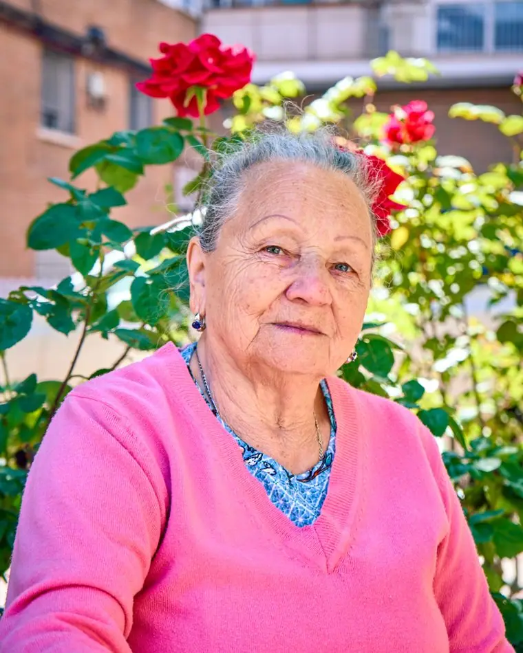
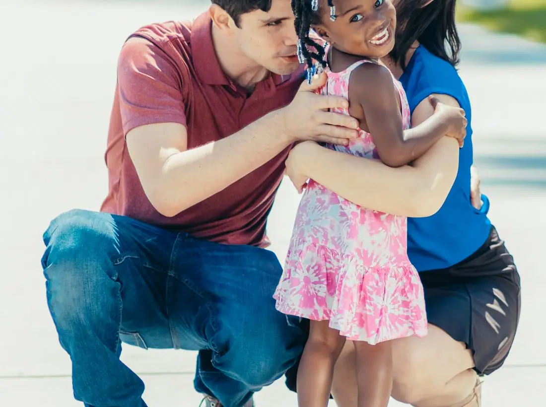
Children in foster care cannot be shown on a public website, so every photograph is of adoptive families who consented, volunteers, or the Closet itself. Where a child appears, they are with a parent and mid-moment. We avoided sad-child imagery entirely: the families on this site are tired and busy, not tragic.
Accessibility
Body text runs at 17px with generous line height, and every color pairing passes WCAG AA in both themes. The Closet's 'open now' status is written out in words as well as color, and the placement line number appears as text in the footer on every page so it can be read aloud by a screen reader or copied in one tap.
Type system
- DisplayRufinaRufina is a sharp, high-contrast serif with a calligraphic stress, the letterform of a family Bible's front page and of the painted Delft tiles that framed Dutch fireplaces.
- TextNunito SansNunito Sans has rounded terminals and open counters, so long practical paragraphs about licensing and respite read gently on a phone at midnight.
Colour and contrast
Every text pairing is checked against WCAG 2.2 in both themes.
Light theme
| Pairing | Sample | Ratio | WCAG |
|---|
| Body text on page | Aa | 14.26:1 | AAA |
| Body text on cards | Aa | 15.84:1 | AAA |
| Secondary text | Aa | 5.6:1 | AA |
| Links | Aa | 7.63:1 | AAA |
| Button text | Aa | 8.48:1 | AAA |
| Accent label text | Aa | 4.86:1 | AA |
| Text on dark bands | Aa | 14.26:1 | AAA |
| Muted text on dark bands | Aa | 7.62:1 | AAA |
| Text on brand bands | Aa | 8.48:1 | AAA |
| Muted text on brand bands | Aa | 5.59:1 | AA |
Dark theme
| Pairing | Sample | Ratio | WCAG |
|---|
| Body text on page | Aa | 15.23:1 | AAA |
| Body text on cards | Aa | 13.52:1 | AAA |
| Secondary text | Aa | 6.81:1 | AA |
| Links | Aa | 8.8:1 | AAA |
| Button text | Aa | 9.22:1 | AAA |
| Accent label text | Aa | 9.34:1 | AAA |
| Text on dark bands | Aa | 16.29:1 | AAA |
| Muted text on dark bands | Aa | 8.21:1 | AAA |
| Text on brand bands | Aa | 9.22:1 | AAA |
| Muted text on brand bands | Aa | 5.56:1 | AA |