Nov07
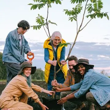
Compost Workshop
10:00 AM · Education Barn
Learn the basics of hot composting.
Come learn, lend a hand or just visit. Everything is beginner-friendly.

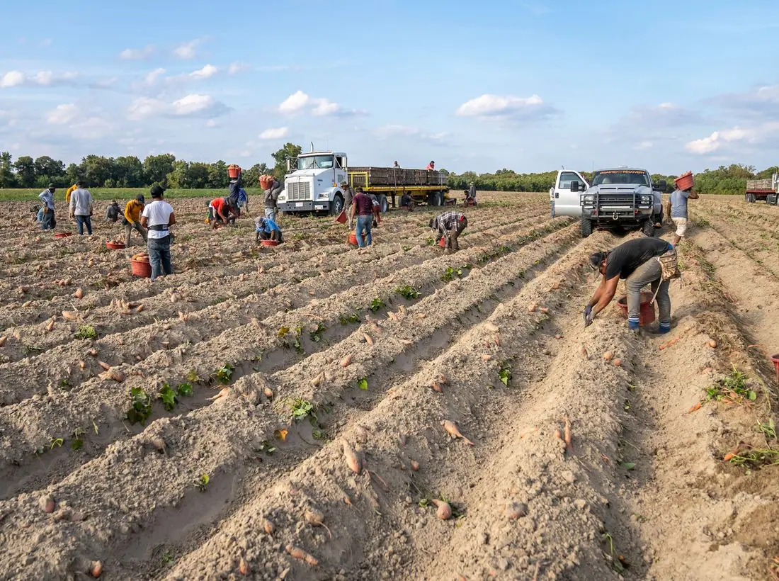
9:00 AM – 1:00 PM · Packard Street Garden
Help us mulch, cover and tuck in 120 beds for winter. Hot cider and donuts for every volunteer.
Learn the basics of hot composting.
Plant next summer's garlic crop together.

Trade seeds and plan your spring beds.

Make and take home three jars of jam.
Start seeds in milk jugs and watch them sprout.

Tour the gardens and reserve your bed.
Design notes
Green Acre is a community garden site with a scalloped pattern, a heavy green headline and a stats band for plots, school gardens and donated produce. It sells plots and workdays as clearly as a hardware store sells tools.
Work Sans at extra bold sets the headline and also sets the body text. It is a wide, sturdy sans that looks practical, and the heaviest weight gives the headline a poster quality. One family keeps the page simple.
The page is pale sage (#F5F8EC) with dark green text (#1B2A14), garden green (#2F7D32) for buttons and a sunflower yellow (#F2C230) accent. The dark theme uses a lighter leaf green (#7FD17F). Green is the obvious choice, and yellow gives it a bright, sunny counterpoint.
A rounded white pill nav has a green logo tile, six links and a green Donate pill. The hero has a scalloped wave pattern, which returns as a divider between sections. Below are rounded cards for garden programs, a stats band and a group of team avatars.
The hero is centred, with 'Grow something good together.' on two lines and a sentence about renting a plot, joining a workday or learning to compost. Garden photos begin right under the fold. A chip names the next Saturday workday.
'Get a plot' is a green pill and 'Join a workday' is an outline. Both are things a visitor can do this month, which fits a garden that depends on regular volunteers. Donate is in the header.
The photographs are close shots of flowers and garden beds, which convey growth and colour. A real garden should show its own raised beds and gardeners, with seasonal updates so the site never looks stale in winter.
Dark green on pale sage is about 14 to 1, and white on the green button about 5.1 to 1. The scalloped background is low contrast, and the headline sits on it at a large size. A theme toggle is in the header.
Each text pairing is checked against WCAG 2.2 in both themes. Ratios are computed from the exact theme colours.
| Pairing | Sample | Ratio | WCAG |
|---|---|---|---|
| Body text on page | Aa | 14.07:1 | AAA |
| Body text on cards | Aa | 15.13:1 | AAA |
| Secondary text | Aa | 5.82:1 | AA |
| Secondary text on tinted bands | Aa | 4.86:1 | AA |
| Links and labels | Aa | 5.64:1 | AA |
| Button text | Aa | 5.12:1 | AA |
| Accent button text | Aa | 11.75:1 | AAA |
| Footer text | Aa | 14.07:1 | AAA |
| Pairing | Sample | Ratio | WCAG |
|---|---|---|---|
| Body text on page | Aa | 15.57:1 | AAA |
| Body text on cards | Aa | 13.76:1 | AAA |
| Secondary text | Aa | 8.08:1 | AAA |
| Secondary text on tinted bands | Aa | 6.07:1 | AA |
| Links and labels | Aa | 9.70:1 | AAA |
| Button text | Aa | 10.62:1 | AAA |
| Accent button text | Aa | 12.40:1 | AAA |
| Footer text | Aa | 15.57:1 | AAA |
Designed by Greater Purpose Web. Names, people, photos and events are sample content.