Why Full Court League looks the way it does
Full Court League runs free basketball for about four hundred Memphis kids across three church and city gyms, with homework before practice and a short talk at halftime. The site behaves like the schedule board in the gym lobby, because the first question from every parent is when and where.
- Built for
- Parents and grandparents signing kids up, the players themselves (ages 9 to 18, mostly on phones), and church members who want to coach, keep score or drive the van.
- Navigation
- Tabbed app bar. Pages behave like tabs in an app: a sticky segmented bar under a compact header.
- Pages
- This week, Divisions, Register, Gyms, Coach & serve, Halftime
- Hero
- a short action form as the hero: the one thing most visitors came to do (request a ride, ask for help, register a child) can be done before they scroll, with reassurance beside it. Variants: a = headline, reassurance and a photo on the left with the form as a raised card on the right; b = a tall photo carrying the headline, with the form and reassurance on a plain panel beside it; c = headline beside a photo, then the form laid out as one horizontal booking bar; This week's schedule is the hero: day columns with what is on, so regulars and newcomers see when to come before anything else
Typography
Saira Extra Condensed in heavy capitals sets the headlines because it is the lettering of jersey numbers and scoreboards: tall, tight and readable from the top row of the bleachers. Archivo, a slightly wide grotesque, carries the body so paragraphs don't feel cramped next to it. Azeret Mono handles times and labels so tip-offs line up in columns like a scoreboard.
Color
Royal blue and ball orange come from the league's own reversible practice jerseys, and the light background is the painted cinder-block of the Park Avenue gym. We kept the orange for small things (labels, the live badge, today's column) so it stays loud. The dark theme is the gym after the lights go down to half: deep blue-black, with the blue lifted to keep contrast.
Layout and navigation
Tabs across the top work like the sections of a team app, which is what teenagers expect and what parents already use for school. Six short tab names, the registration button always visible, and the wordmark footer stamped across the bottom like a gym floor.
The hero
The home page opens with this week's schedule because that is the question behind most visits: is there practice today, what time is the game. Today's column is marked automatically, and every item names the gym, so a grandparent can find it without calling the office.
Calls to action
"Register a player" is the main action, since a child on the roster is the goal. The others are specific: coach a team, find a gym, sponsor a jersey, hear this week's halftime talk. Sponsoring a jersey ($40) is the giving action because donors can picture exactly what they bought.
Photography
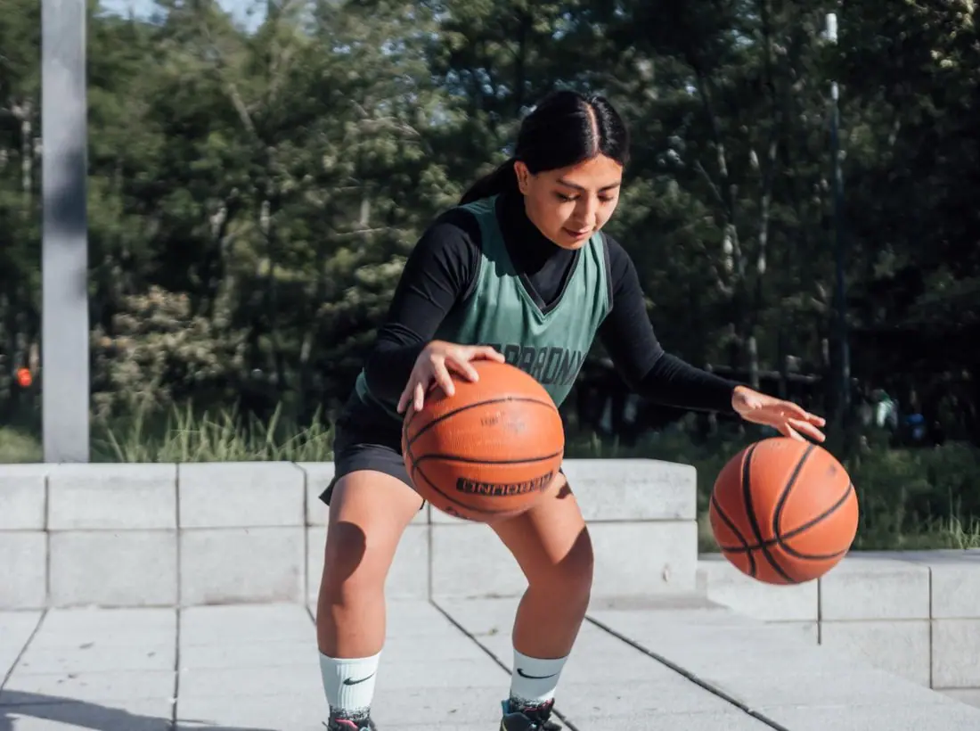
Real outdoor and gym basketball, mostly Black kids and teenagers playing, because that is who plays in Orange Mound, Frayser and Whitehaven. We chose action and candid moments over posed team photos, and girls have equal space with boys. No player is ever named beside a photo of a minor.
Accessibility
Display type is never used for long text, and the schedule is a real table and list underneath its styling. Tap targets on the tab bar are at least 44px. Times are written in full (4:00 PM) rather than abbreviated, and orange is never the only signal for today's column.
Type system
- DisplaySaira Extra CondensedSaira Extra Condensed is the narrow, squared-off lettering of jersey numbers, scoreboards and gym banners, so the schedule reads like it's posted on the wall by the water fountain.
- TextArchivoArchivo is a sturdy grotesque with a little width to it; it balances the tall, tight display face and stays readable on a parent's cracked phone screen in the bleachers.
- AccentAzeret MonoA monospaced face for times, scores and labels, so every tip-off time lines up like a scoreboard.
Colour and contrast
Every text pairing is checked against WCAG 2.2 in both themes.
Light theme
| Pairing | Sample | Ratio | WCAG |
|---|
| Body text on page | Aa | 15.46:1 | AAA |
| Body text on cards | Aa | 18.1:1 | AAA |
| Secondary text | Aa | 5.81:1 | AA |
| Links | Aa | 8.77:1 | AAA |
| Button text | Aa | 10.27:1 | AAA |
| Accent label text | Aa | 5.34:1 | AA |
| Text on dark bands | Aa | 15.46:1 | AAA |
| Muted text on dark bands | Aa | 7.99:1 | AAA |
| Text on brand bands | Aa | 10.27:1 | AAA |
| Muted text on brand bands | Aa | 6.52:1 | AA |
Dark theme
| Pairing | Sample | Ratio | WCAG |
|---|
| Body text on page | Aa | 16.8:1 | AAA |
| Body text on cards | Aa | 15.26:1 | AAA |
| Secondary text | Aa | 7.23:1 | AAA |
| Links | Aa | 8.26:1 | AAA |
| Button text | Aa | 8.14:1 | AAA |
| Accent label text | Aa | 8.09:1 | AAA |
| Text on dark bands | Aa | 17.45:1 | AAA |
| Muted text on dark bands | Aa | 8.65:1 | AAA |
| Text on brand bands | Aa | 8.14:1 | AAA |
| Muted text on brand bands | Aa | 5.15:1 | AA |