Why Far Shore looks the way it does
A sending agency's site has two audiences who rarely overlap: people quietly wondering whether they should go, and the churches and families who keep workers on the field. This design gives the wonderers a low-stakes first step and gives supporters a clear, accountable way to back a named family.
- Built for
- Prospective long-term workers in their twenties to fifties, partner churches, and monthly supporters across the Front Range and beyond.
- Navigation
- Split screen. Identity and navigation stay fixed on the left half while content scrolls on the right, like a printed programme.
- Pages
- Home, Going, Fields, Support, Pray, Who we are, Talk with us
- Hero
- a short action form as the hero: the one thing most visitors came to do (request a ride, ask for help, register a child) can be done before they scroll, with reassurance beside it. Variants: a = headline, reassurance and a photo on the left with the form as a raised card on the right; b = a tall photo carrying the headline, with the form and reassurance on a plain panel beside it; c = headline beside a photo, then the form laid out as one horizontal booking bar; a drawn neighbourhood map as the opener, with numbered pins for each stop or campus and a list of names, addresses and times beside it; pointing at a list item lights up its pin. Built for mobile pantries, multi-site churches and bus routes. Variants: a = map on the left, headline and stop list on the right; b = headline across the top, a wide map, and the stops as columns beneath; c = a route: stops as a connected timeline beside a map with the path drawn between pins
Typography
Cardo was cut for scholars of Greek and Hebrew texts, and much of Far Shore's work ends at a translation desk, so the headlines carry that bookish, patient voice at large sizes. Commissioner does the reading: a quiet sans with slight flares that sits comfortably beside a classical serif. DM Mono handles dates, times and field labels like entries in a logbook.
Color
The palette comes from an old nautical chart: a pale sea-paper ground, deep harbour teal for the brand and a brass ochre for small accents. In dark mode the ground becomes night water rather than black, the teal lifts toward sea glass and the brass warms so it still reads as a lamp.
Layout and navigation
The split panel keeps the agency's one-line promise and the main action in view on every page. Visitors who arrive here are usually reading slowly, often late at night, and a fixed panel lets them wander without ever losing the way back to a real conversation.
The hero
Most mission sites open with a sweeping overseas photo. We open with a map of Colorado Springs instead, because the honest first step is local: a free supper where someone home from the field answers questions. Five tables in five neighborhoods, each on a different week of the month.
Calls to action
The main button says Talk with a mobilizer because that is what actually happens next: a person, not an application. Supporting actions are specific to what each audience does: Save a seat at a Table, Support a worker, Get the prayer letter.
Photography
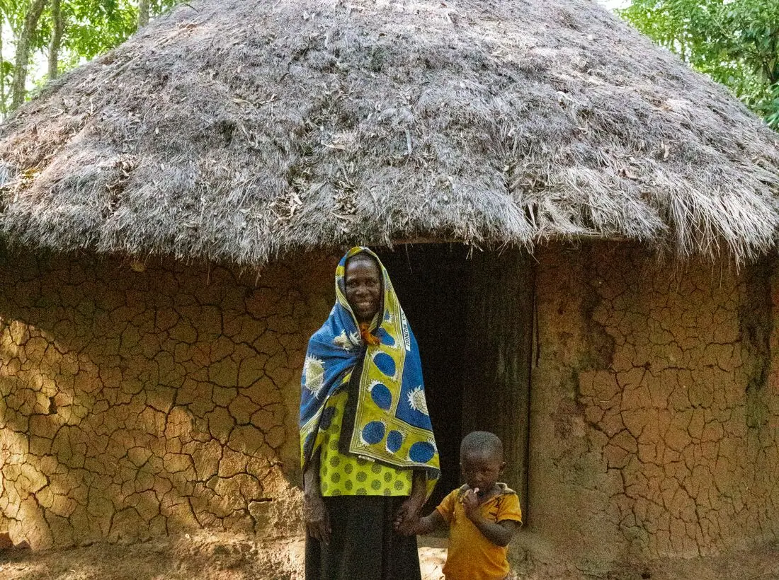
Field photos show places and people at work rather than visitors posing with locals. For the creative-access field we use landscape only and no faces, which is how agencies protect workers and the people they live among.
Accessibility
Body text is 17px on a 64-character measure with contrast well above 4.5:1 in both themes. The map is supported by a full text list of every Table with times and directions, and every form field has a visible label.
Type system
- DisplayCardoCardo was drawn for biblical and classical scholars, the face of a well-thumbed translation desk, which is exactly where much of our work ends up.
- TextCommissionerA calm, slightly flared sans that stays readable in long field letters and next to a bookish serif.
- AccentDM MonoCoordinates, dates and times set like a logbook.
Colour and contrast
Every text pairing is checked against WCAG 2.2 in both themes.
Light theme
| Pairing | Sample | Ratio | WCAG |
|---|
| Body text on page | Aa | 13.95:1 | AAA |
| Body text on cards | Aa | 15.15:1 | AAA |
| Secondary text | Aa | 5.6:1 | AA |
| Links | Aa | 6.92:1 | AA |
| Button text | Aa | 7.94:1 | AAA |
| Accent label text | Aa | 5.22:1 | AA |
| Text on dark bands | Aa | 13.95:1 | AAA |
| Muted text on dark bands | Aa | 7.46:1 | AAA |
| Text on brand bands | Aa | 7.94:1 | AAA |
| Muted text on brand bands | Aa | 5.27:1 | AA |
Dark theme
| Pairing | Sample | Ratio | WCAG |
|---|
| Body text on page | Aa | 14.98:1 | AAA |
| Body text on cards | Aa | 13.42:1 | AAA |
| Secondary text | Aa | 6.71:1 | AA |
| Links | Aa | 8.31:1 | AAA |
| Button text | Aa | 8.66:1 | AAA |
| Accent label text | Aa | 9.12:1 | AAA |
| Text on dark bands | Aa | 16.02:1 | AAA |
| Muted text on dark bands | Aa | 8.11:1 | AAA |
| Text on brand bands | Aa | 8.66:1 | AAA |
| Muted text on brand bands | Aa | 5.34:1 | AA |