Why Fairway Legal Aid looks the way it does
A civil legal aid office whose visitors usually arrive with a piece of paper they are afraid of: an eviction notice, a custody summons, a letter from a debt collector. The site leads with a search that turns that fear into a named problem and a next step, then shows who qualifies before it asks anyone to apply.
- Built for
- Low-income tenants, parents, older homeowners and families on inherited land across central Mississippi, plus the volunteer lawyers and donors who keep the doors open.
- Navigation
- Classic top bar. Logo left, pages right, one action. Familiar to every visitor.
- Pages
- Get help, Who qualifies, Eviction, Clinics, Self-help, For lawyers, Our work
- Hero
- a short action form as the hero: the one thing most visitors came to do (request a ride, ask for help, register a child) can be done before they scroll, with reassurance beside it. Variants: a = headline, reassurance and a photo on the left with the form as a raised card on the right; b = a tall photo carrying the headline, with the form and reassurance on a plain panel beside it; c = headline beside a photo, then the form laid out as one horizontal booking bar; a drawn neighbourhood map as the opener, with numbered pins for each stop or campus and a list of names, addresses and times beside it; pointing at a list item lights up its pin. Built for mobile pantries, multi-site churches and bus routes. Variants: a = map on the left, headline and stop list on the right; b = headline across the top, a wide map, and the stops as columns beneath; c = a route: stops as a connected timeline beside a map with the path drawn between pins; A 'What do you need today?' search that filters real services as you type, for organisations whose visitors arrive with an urgent need
Typography
Public Sans is the typeface of U.S. government websites, so it carries the authority of an official notice without the coldness of one when it is set heavy and tight. Body copy is Source Serif 4 at 18px, because the explanations of court steps are long and a text serif reads like a careful handout. DM Mono labels the dates, phone numbers and form names, the way a docket stamps them.
Color
Ballpoint blue and legal-pad yellow: the two colors of every intake interview, where a lawyer takes notes in blue ink on a yellow pad. The page ground is a cool paper gray rather than cream, and the yellow is kept for highlights and small labels so it never competes with text. In dark mode the blue lifts to a periwinkle that stays at 7:1 on the night ground.
Layout and navigation
A classic top bar, because many visitors are older, on a borrowed phone, or reading over a clerk's counter, and a plain row of named pages is the least surprising thing we can give them. The one button in the bar is 'Apply for free help'. Everything else waits until the visitor has found their problem.
The hero
The first thing on the page is a search box asking what the legal problem is. People type 'evict', 'custody' or 'my granddaddy's land' and the list narrows to the right page, with the deadline that matters printed under each one. Quick chips cover the six problems behind four-fifths of our calls.
Calls to action
Every action names the next real step: 'Apply for free help', 'Read this before your hearing', 'Find a clinic near you'. For lawyers it is 'Take a clinic shift'; for donors it is 'Pay for a hearing', tied to what $150 actually buys. Nothing says 'Learn more'.
Photography
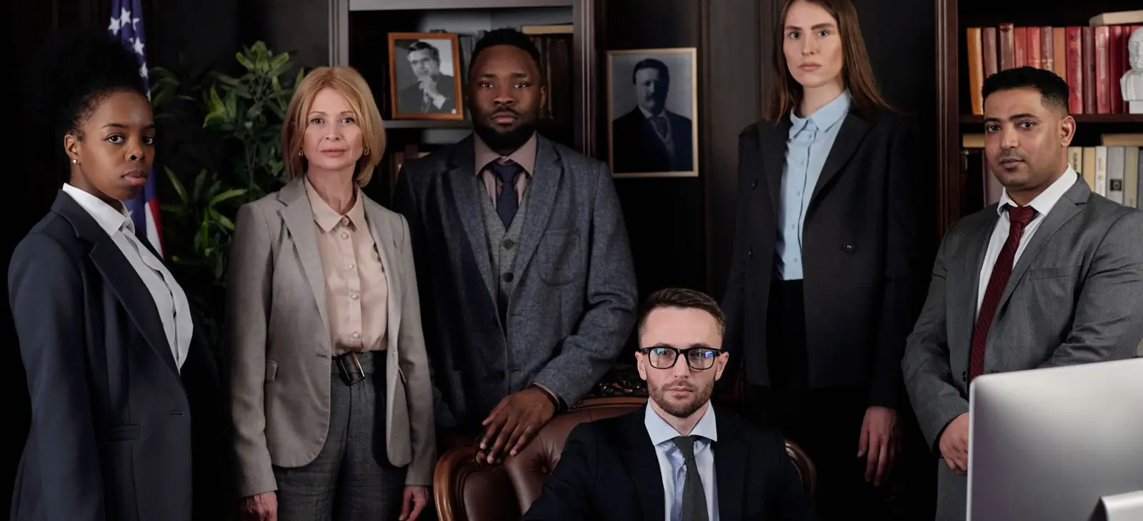
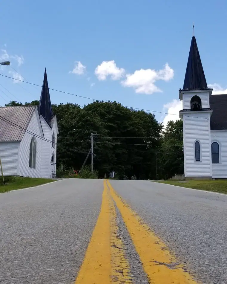
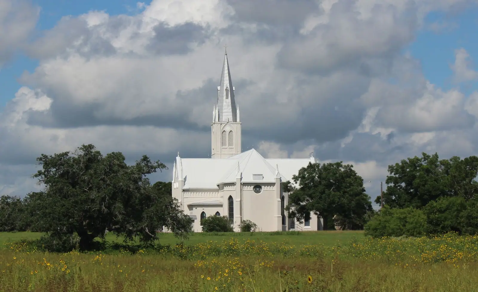
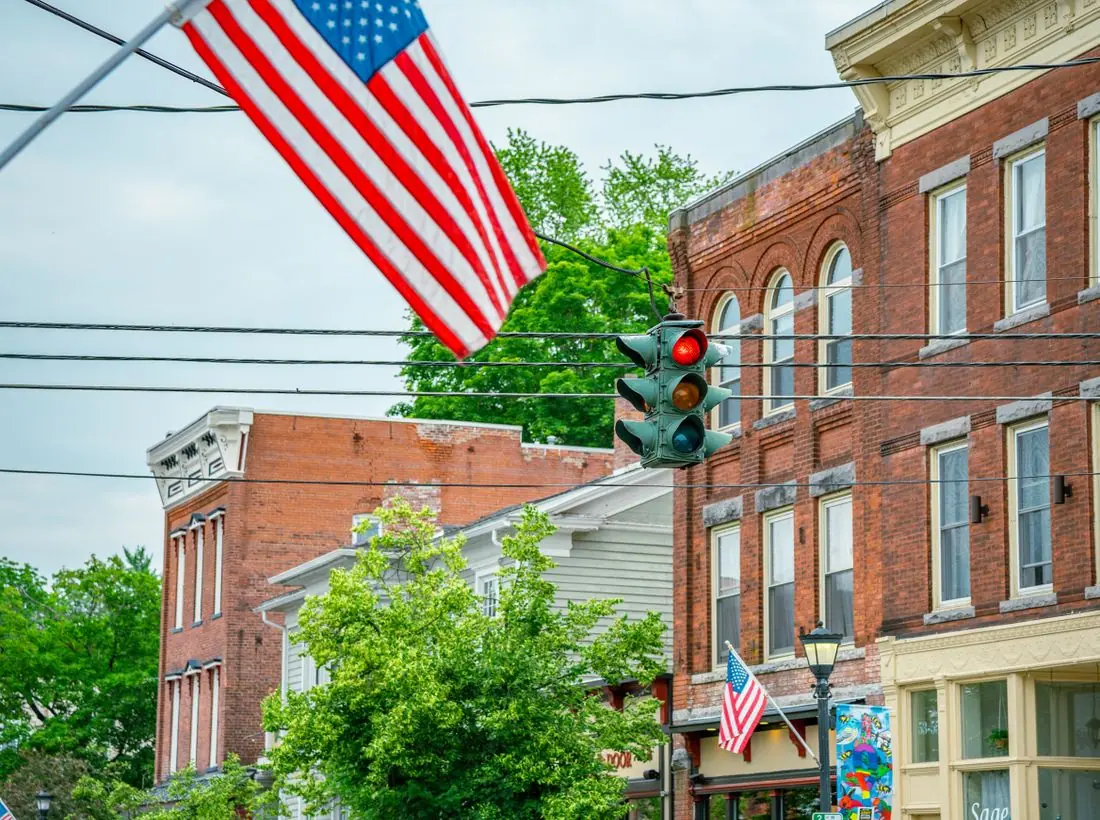
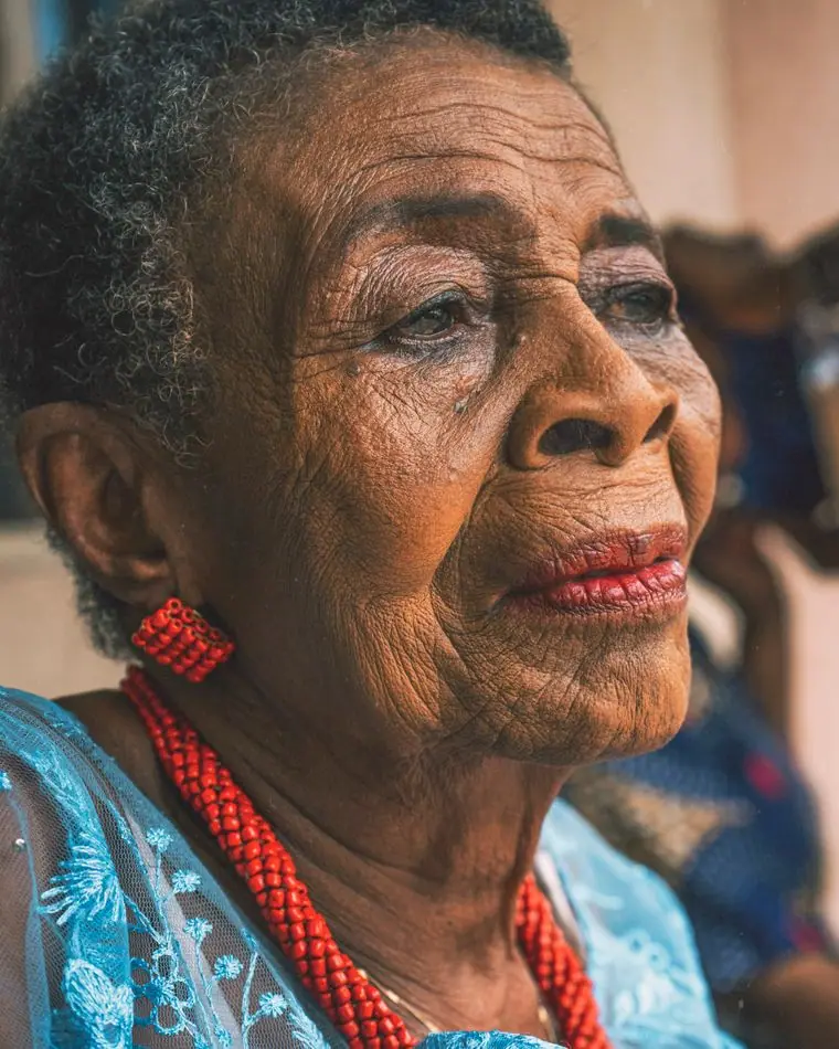
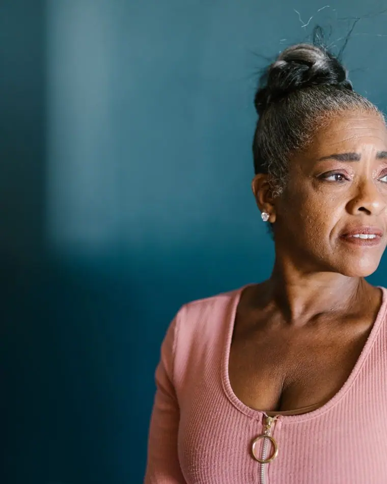
Calm rooms and open country rather than courtrooms: an intake table in a sitting room, an attorney with a clipboard, the white churches and bean fields of Holmes County where the heirs' property work happens. The home page leads with an older couple standing on their own land, because keeping homes and land is most of what this office does. The one staff group photo is the only formal picture on the site.
Accessibility
Plain language at about a sixth-grade reading level, an 18px body, and contrast above 7:1 for body text in both themes. The search works with a keyboard and announces how many services match. Deadlines are written as words as well as dates, because a misread date can cost someone their home.
Type system
- DisplayPublic SansPublic Sans was drawn for the U.S. Web Design System, the face of benefit portals and federal forms. Set heavy and tight it keeps that official clarity but loses the chill, so a frightened tenant reads it as 'this is the real thing' and also 'someone here will talk to me.'
- TextSource Serif 4Explanations of court steps run long. A sturdy text serif at 18px reads like a well-made handout and holds up in a phone browser at the courthouse.
- AccentDM MonoLabels, dates and phone numbers set like the stamped lines on a docket sheet, so the practical details are easy to find again.
Colour and contrast
Every text pairing is checked against WCAG 2.2 in both themes.
Light theme
| Pairing | Sample | Ratio | WCAG |
|---|
| Body text on page | Aa | 15.31:1 | AAA |
| Body text on cards | Aa | 16.73:1 | AAA |
| Secondary text | Aa | 5.64:1 | AA |
| Links | Aa | 8.78:1 | AAA |
| Button text | Aa | 9.92:1 | AAA |
| Accent label text | Aa | 11.34:1 | AAA |
| Text on dark bands | Aa | 15.31:1 | AAA |
| Muted text on dark bands | Aa | 7.99:1 | AAA |
| Text on brand bands | Aa | 9.92:1 | AAA |
| Muted text on brand bands | Aa | 6.34:1 | AA |
Dark theme
| Pairing | Sample | Ratio | WCAG |
|---|
| Body text on page | Aa | 15.23:1 | AAA |
| Body text on cards | Aa | 13.77:1 | AAA |
| Secondary text | Aa | 6.73:1 | AA |
| Links | Aa | 8.98:1 | AAA |
| Button text | Aa | 9.09:1 | AAA |
| Accent label text | Aa | 12.22:1 | AAA |
| Text on dark bands | Aa | 16.03:1 | AAA |
| Muted text on dark bands | Aa | 8.07:1 | AAA |
| Text on brand bands | Aa | 9.09:1 | AAA |
| Muted text on brand bands | Aa | 5.51:1 | AA |