Why Evening Light Hospice looks the way it does
A hospice site that opens with a letter instead of a sales pitch. Most people arrive here frightened and short on time, often late at night, so the 24-hour nurse line sits in the header on every page and nothing on the site asks them to decide anything quickly.
- Built for
- Adult children and spouses of people who are very ill, doctors' offices making referrals, grieving families in the year afterwards, and volunteers.
- Navigation
- Centred masthead. The name sits centred like a printed masthead; pages run underneath. Signals heritage and calm.
- Pages
- Welcome, Starting care, Grief support, Volunteer, Our people, Remember someone
- Hero
- a short action form as the hero: the one thing most visitors came to do (request a ride, ask for help, register a child) can be done before they scroll, with reassurance beside it. Variants: a = headline, reassurance and a photo on the left with the form as a raised card on the right; b = a tall photo carrying the headline, with the form and reassurance on a plain panel beside it; c = headline beside a photo, then the form laid out as one horizontal booking bar; A personal letter from the pastor or director as the opening: a greeting, two or three short paragraphs and a handwritten-style signature, with their portrait. Variants: a = the letter on a sheet with the portrait overlapping its left edge; b = an editor's-letter layout with a huge greeting, two text columns and a small captioned portrait
Typography
Ibarra Real Nova is a revival of the Spanish types Joaquín Ibarra cut in Madrid in the 1780s. It has the calm of a well-printed book and quietly belongs to Santa Fe without leaning on chile peppers and Kokopelli. Figtree carries the body at 18px with loose line spacing, because many readers are older or reading through tears. A handwriting face appears once, for Lucía's signature.
Color
The violet comes from the Sangre de Cristo range at the last minute of sunset, which is also where the name Evening Light comes from. The turquoise is the color of half the front doors on Canyon Road. Both sit on a rosy adobe plaster rather than white, so the pages feel like a room with the lamps on. The dark theme is a deep dusk violet, kept warm, never pure black.
Layout and navigation
A centered header with the name in the middle, like a letterhead, and the 24-hour nurse line as its one button. The layout is narrow and generous, 1120px at most, because no one here should have to scan.
The hero
A letter from the executive director, a nurse, in her own voice. It tells families what hospice is and is not, and it says out loud that calling us is not giving up. A big photograph would feel like advertising at this moment; a letter, with a small portrait of the nurse who wrote it, feels like being spoken to.
Calls to action
Every action is soft and specific: talk to a nurse, ask about starting care, find a grief group, sit with someone. Buttons are underlined text links instead of bold blocks, so nothing on the page shouts. Giving is framed as remembering someone, which is how almost all hospice gifts are made.
Photography
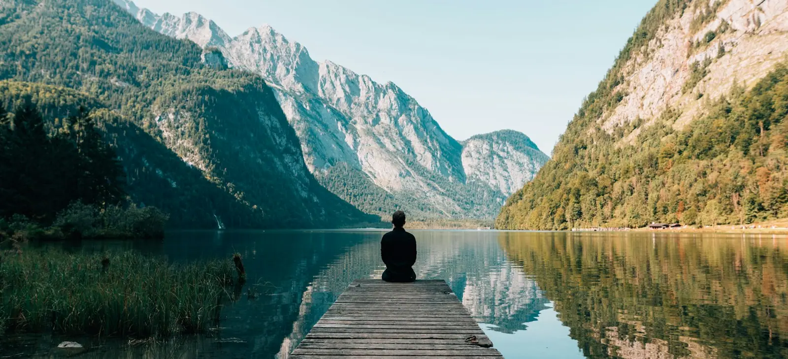
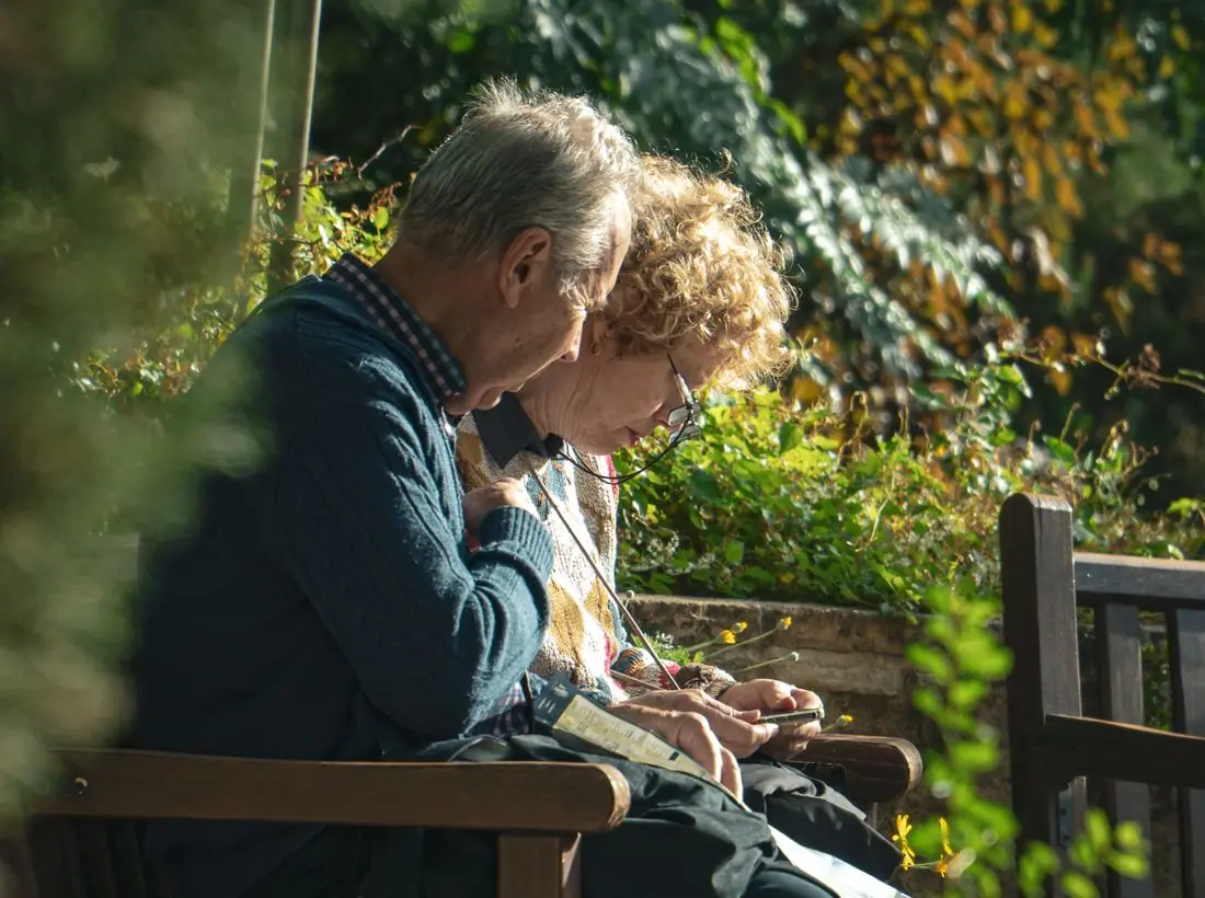
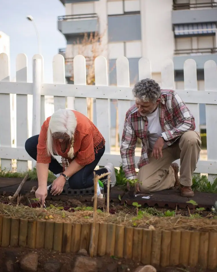
Hands, tea, a cat on a quilt, a couple in a garden. People are shown being cared for at home and never in distress, and we avoided hospital corridors except where the copy talks about hospitals.
Accessibility
Large body text, high contrast in both themes, underlined links that do not rely on color, and plain words throughout: we say dying where we mean dying. The phone number is real text that can be read aloud by a screen reader and tapped on any phone.
Type system
- DisplayIbarra Real NovaIbarra Real Nova revives the type Joaquín Ibarra cut in Madrid for his 1780 Don Quixote: Spanish, bookish and unhurried, at home in a city of portales and old missions.
- TextFigtreeA soft, open sans with round shapes that stays easy to read for tired eyes at two in the morning.
- AccentHomemade AppleUsed only for the director's signature, so the opening letter reads as one person's handwriting.
Colour and contrast
Every text pairing is checked against WCAG 2.2 in both themes.
Light theme
| Pairing | Sample | Ratio | WCAG |
|---|
| Body text on page | Aa | 12.63:1 | AAA |
| Body text on cards | Aa | 14.14:1 | AAA |
| Secondary text | Aa | 5.52:1 | AA |
| Links | Aa | 6.64:1 | AA |
| Button text | Aa | 7.93:1 | AAA |
| Accent label text | Aa | 5.33:1 | AA |
| Text on dark bands | Aa | 12.63:1 | AAA |
| Muted text on dark bands | Aa | 6.96:1 | AA |
| Text on brand bands | Aa | 7.93:1 | AAA |
| Muted text on brand bands | Aa | 5.32:1 | AA |
Dark theme
| Pairing | Sample | Ratio | WCAG |
|---|
| Body text on page | Aa | 14.56:1 | AAA |
| Body text on cards | Aa | 13.16:1 | AAA |
| Secondary text | Aa | 6.56:1 | AA |
| Links | Aa | 8.97:1 | AAA |
| Button text | Aa | 9.48:1 | AAA |
| Accent label text | Aa | 9.11:1 | AAA |
| Text on dark bands | Aa | 15.65:1 | AAA |
| Muted text on dark bands | Aa | 7.94:1 | AAA |
| Text on brand bands | Aa | 9.48:1 | AAA |
| Muted text on brand bands | Aa | 5.63:1 | AA |