Why Cradle & Co. looks the way it does
Cradle & Co. is a small church-backed ministry that keeps women company through pregnancy and the first year with a baby: a mentor who answers texts, a free baby closet, rides to appointments and two weekly moms' groups. The site is written for someone who may be frightened, tired or reading with one hand, so it starts by asking where she is rather than telling her who we are.
- Built for
- Women who have just found out they're pregnant, new moms in their first year (many young, single or far from family), and the churches, grandmothers and neighbors who want to help.
- Navigation
- Centred masthead. The name sits centred like a printed masthead; pages run underneath. Signals heritage and calm.
- Pages
- Home, Just found out, Baby closet, Mom groups, Help out, Our story
- Hero
- A personal letter from the pastor or director as the opening: a greeting, two or three short paragraphs and a handwritten-style signature, with their portrait. Variants: a = the letter on a sheet with the portrait overlapping its left edge; b = an editor's-letter layout with a huge greeting, two text columns and a small captioned portrait; Three doors instead of one headline: visitors pick the path that fits them (for example New here, Need help, Want to help)
Typography
Unna is a soft transitional serif with rounded joins, warm enough for a birth announcement but sturdy enough for a headline. Nunito Sans sets the body in round, open shapes that stay easy to read on a phone in a dark nursery. Caveat appears only for the director's signature and small handwritten notes, like the card tucked into every closet bag.
Color
The deep rose is taken from the hand-knit blankets volunteers bring in every week, and the sage is the color of the front door at the house. The neutrals lean slightly green rather than cream, which keeps the site from looking like a baby-shower invitation. In dark mode, for night feeds, the rose lifts to a soft pink on a warm charcoal so nothing glares.
Layout and navigation
A centred top bar with six plain words keeps things calm and symmetrical. The one action beside them, Text a mentor today, is the thing we most want a frightened visitor to do, so it is always in reach.
The hero
The home page opens with three doors: Just found out, Baby's here, Want to help. A woman who has just seen two lines on a test should not have to read about our history to find the text line. Each door has its own photograph and leads to a page written only for her.
Calls to action
Buttons describe a small, concrete step: Text a mentor today, Pick up diapers, Come Tuesday morning, Stock the closet. Nothing says sign up or register, because many of the women we meet have filled in enough forms this month.
Photography
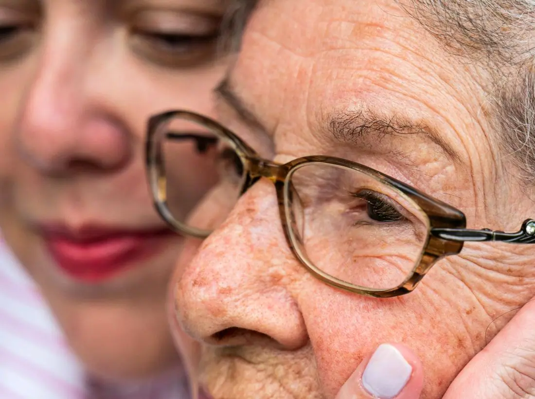
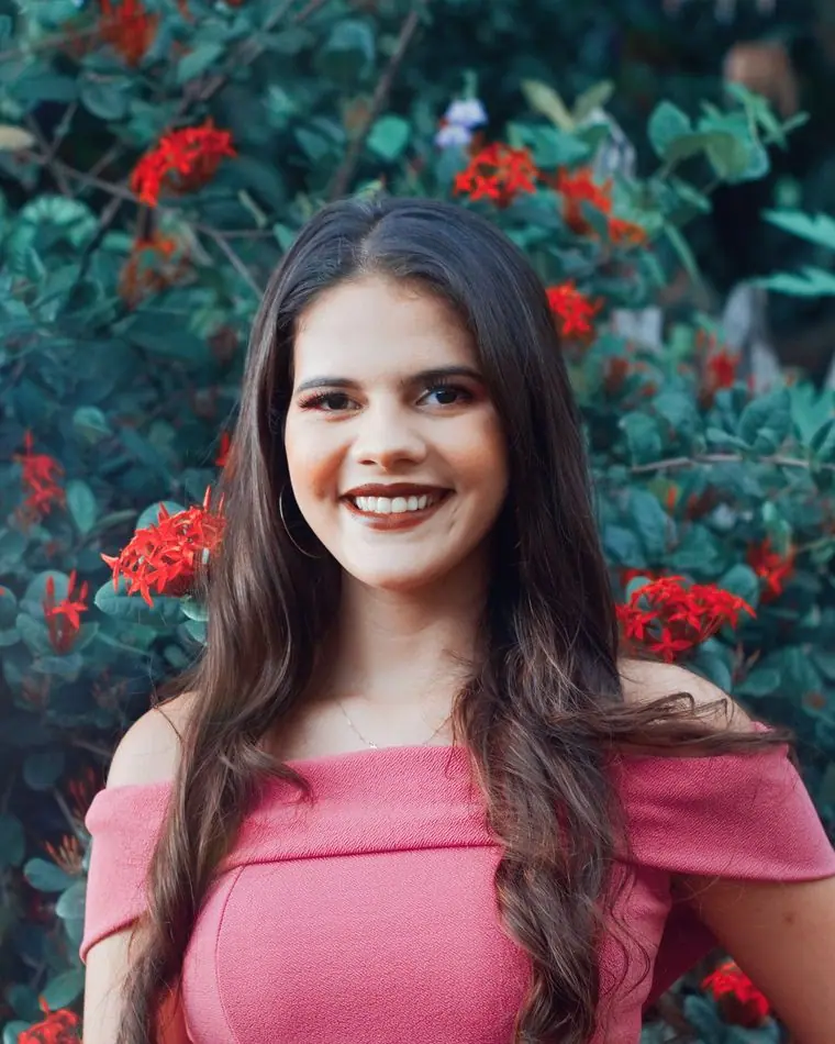
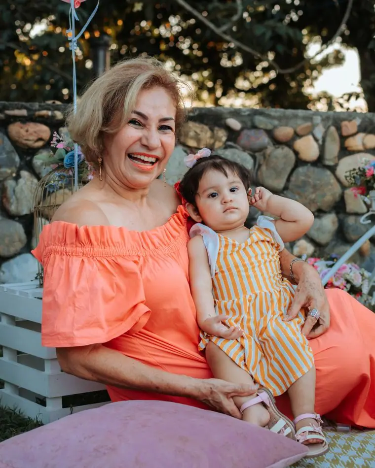
Women of different ages and backgrounds, hands around tiny fingers, volunteers at the closet shelves. The posed studio newborns are kept small and mostly on the giving cards, where a donor wants to picture who the diapers are for. We never show an ultrasound or anything that might feel like pressure.
Accessibility
Body text is 18px with generous line height, every button is large enough to tap one-handed, and both color themes meet WCAG AA. The text line, the 988 crisis line and the Nebraska Safe Haven information sit on the Just found out page in plain words.
Type system
- DisplayUnnaUnna is a gentle transitional serif with soft, rounded joins, closer to a handwritten birth announcement than a clinic sign.
- TextNunito SansRounded, open and easy to read one-handed on a phone at 3 AM.
- AccentCaveatA handwritten hand for the director's signature and the notes in the margins, like a card tucked into a gift bag.
Colour and contrast
Every text pairing is checked against WCAG 2.2 in both themes.
Light theme
| Pairing | Sample | Ratio | WCAG |
|---|
| Body text on page | Aa | 13.89:1 | AAA |
| Body text on cards | Aa | 15.33:1 | AAA |
| Secondary text | Aa | 5.78:1 | AA |
| Links | Aa | 6.11:1 | AA |
| Button text | Aa | 6.75:1 | AA |
| Accent label text | Aa | 4.96:1 | AA |
| Text on dark bands | Aa | 13.89:1 | AAA |
| Muted text on dark bands | Aa | 7.51:1 | AAA |
| Text on brand bands | Aa | 6.75:1 | AA |
| Muted text on brand bands | Aa | 4.62:1 | AA |
Dark theme
| Pairing | Sample | Ratio | WCAG |
|---|
| Body text on page | Aa | 15.23:1 | AAA |
| Body text on cards | Aa | 13.75:1 | AAA |
| Secondary text | Aa | 6.81:1 | AA |
| Links | Aa | 8.84:1 | AAA |
| Button text | Aa | 9.32:1 | AAA |
| Accent label text | Aa | 10.04:1 | AAA |
| Text on dark bands | Aa | 16.35:1 | AAA |
| Muted text on dark bands | Aa | 8.3:1 | AAA |
| Text on brand bands | Aa | 9.32:1 | AAA |
| Muted text on brand bands | Aa | 5.57:1 | AA |