Why Common Ground looks the way it does
Common Ground is a community foundation site with navy type on pale blue, a faint grid and a big serif headline. It looks organised and trustworthy, which suits an organisation that manages other people's gifts.
- Built for
- Local donors, nonprofit leaders applying for grants, and professional advisors who refer clients to a foundation.
- Navigation
- Sticky frosted bar with the full menu and a Give button. On phones, a bottom tab bar plus a quick-links launcher.
- Pages
- Home, About, Visit, Grants, News, Events, Giving, Contact
- Hero
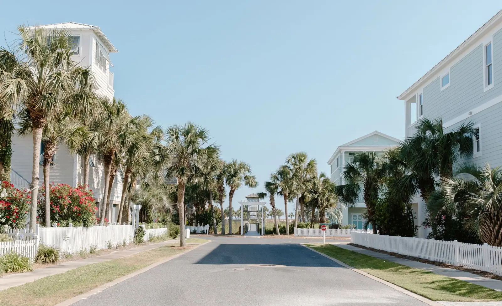
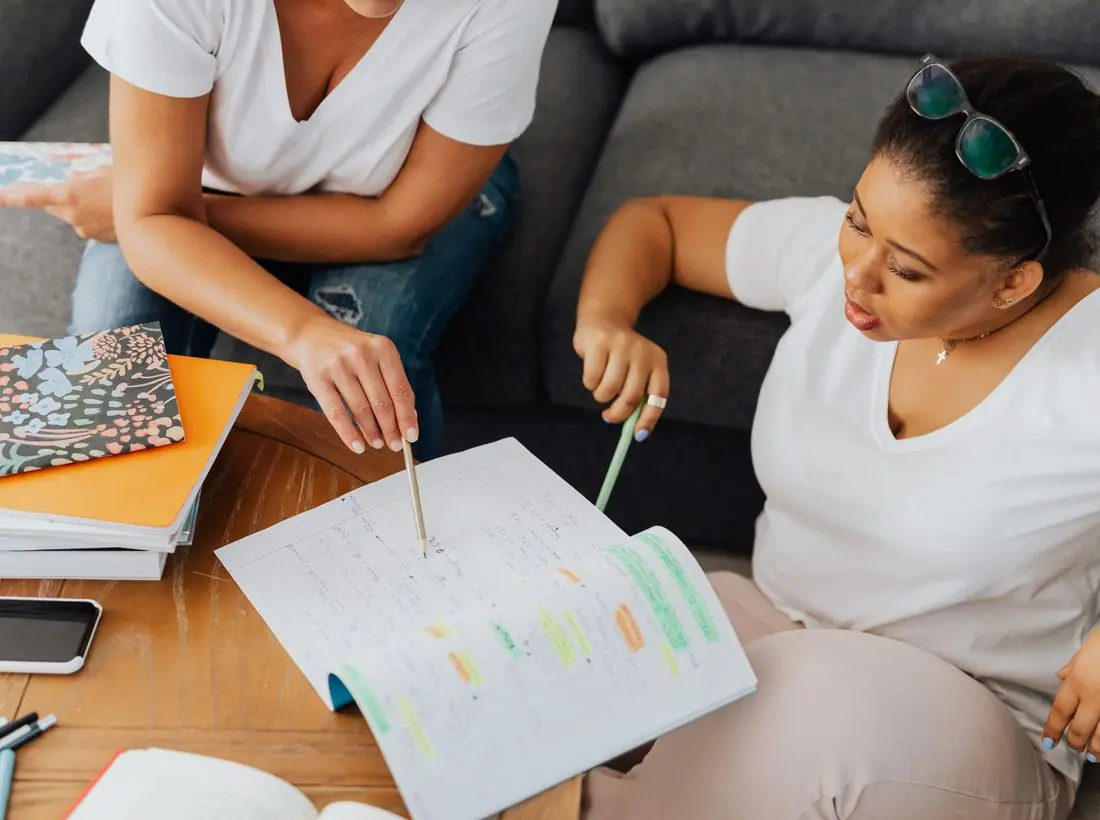
- Centred headline over a three-photo collage.
Typography
DM Serif Display sets the headline at about 90 pixels. It has high contrast and strong, rounded forms that read as authoritative. Manrope handles body text, with a modern, even shape that is good for figures and dates. The pair feels like an annual report.
Colour
The page is pale blue (#EAF1F8) with deep navy text (#0F2240) and a navy brand colour (#17386B). Coral (#F0643C) is the accent. The dark theme uses a lighter periwinkle (#8DB2EC). Navy is a conventional colour for financial trust, and the coral prevents the page from feeling stiff.
Layout and navigation
A bar with a navy logo tile, the full name, six links and a navy Giving button. A faint grid pattern sits behind the hero like graph paper. Below are a stats band reporting $4.2M granted, 160 programs and 2,300 volunteers, rounded photo cards and a scrolling word marquee.
The hero
The hero is centred and typographic, with no photograph. 'Strong communities are built together.' fills three lines, followed by a sentence explaining that $4.2 million reached 160 programs. A chip shows the next open office hours.
Calls to action
'Give locally' is the navy primary button and 'Apply for a grant' is outlined. The two buttons address the foundation's two audiences, donors and grantees. Both are in the hero, so neither group has to search.
Photography
The hero has no photo, so the first impression comes from type and structure. Photos appear lower in rounded cards, and a real foundation should use portraits of grantees and projects, with names and consent.
Accessibility
Navy on pale blue measures about 14 to 1, and white on the navy button about 11.6 to 1. The grid pattern is faint, though a few thin lines run behind body text, so a real build could reduce them at that point. A theme toggle is in the header.
Type system
- DisplayDM Serif DisplayDM Serif Display looks established and formal, which gives a grantmaker credibility.
- TextManropeManrope is clean and its numerals are clear, which helps in a report-heavy audience.
Colour and contrast
Each text pairing is checked against WCAG 2.2 in both themes. Ratios are computed from the exact theme colours.