Nov07
Listener Coffee Meetup
9:00 AM · Studio Lobby
Meet the hosts over coffee and donuts.
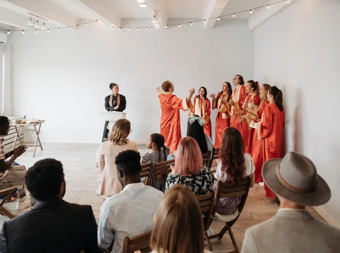
7:00 PM · Chapel Radio Studio
Sit in the studio audience for a special live Open Line, with snacks and a Q&A afterward. Seats are limited to 60.
Meet the hosts over coffee and donuts.
Learn to start a podcast at your church.
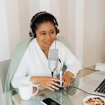
A 25-day devotional series begins.
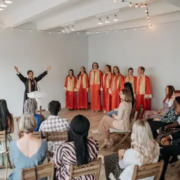
Sing along with the Hymn Hour team.
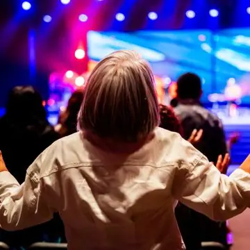
Read and listen through a book in 30 days.
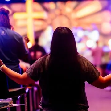
Tour the studio and meet the crew.
Design notes
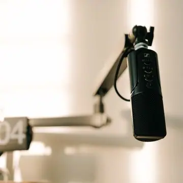
Chapel Radio is a podcast and media ministry site with a pink-grey hero card, a microphone photo and a big sans-serif headline. It looks like a streaming app, so listeners know what to do within a second.
Space Grotesk Bold is used for the headline and body copy, with small labels in a monospace-like spacing. The shapes are geometric and technical, in keeping with audio and software. 'Listen. Learn. Share.' fits on two lines at about 90 pixels.
The page uses cool off-white (#F4F6F9) with near-black text (#0D0F14), broadcast red (#C7261A) as the brand colour and a teal (#0F7F74) accent for the live indicator. The hero panel is a soft rose tint. The dark theme is first and uses a coral red (#FF5A4E). Red is the colour of an on-air light, so it signals live content straight away.
A white bar has a red circle logo, the name, six links and a red Support button. Below are rounded content cards for shows and episodes. The structure follows podcast apps, with a clear list of shows and a latest episode, so a regular listener finds a familiar pattern.
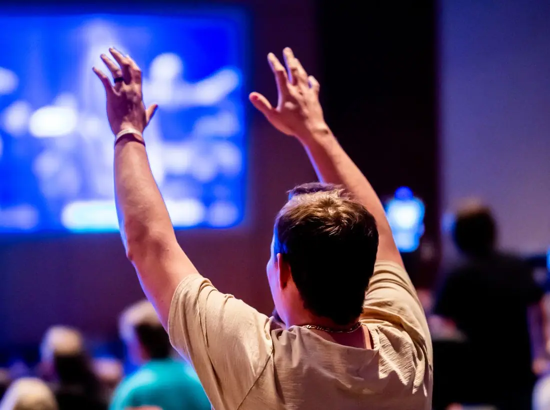
The hero is split. On the left is the eyebrow 'On air 24/7. Free on every app.', the headline and a short line on devotionals and call-in shows. On the right is a tall photo of a microphone with a smaller concert image overlapping. A chip shows the next live show.
'Listen now' is a solid red button and 'All shows' is outlined. The first action plays audio, which is the reason people come. Support replaces Give in the header, which suits a listener-funded station.
The main photo is a macro shot of a microphone with soft background light, which communicates audio instantly. The overlapping concert image adds energy. A real station should add portraits of hosts, since listeners attach to voices and want a face to go with them.
Near-black on off-white is about 17.7 to 1, and white on the red button about 5.6 to 1. Audio content should always have transcripts, and a real build should add them next to each episode. The theme toggle supports listeners using the site at night.
Each text pairing is checked against WCAG 2.2 in both themes. Ratios are computed from the exact theme colours.
| Pairing | Sample | Ratio | WCAG |
|---|---|---|---|
| Body text on page | Aa | 16.93:1 | AAA |
| Body text on cards | Aa | 15.39:1 | AAA |
| Secondary text | Aa | 8.52:1 | AAA |
| Secondary text on tinted bands | Aa | 7.26:1 | AAA |
| Links and labels | Aa | 6.23:1 | AA |
| Button text | Aa | 6.40:1 | AA |
| Accent button text | Aa | 10.88:1 | AAA |
| Footer text | Aa | 16.93:1 | AAA |
| Pairing | Sample | Ratio | WCAG |
|---|---|---|---|
| Body text on page | Aa | 17.71:1 | AAA |
| Body text on cards | Aa | 19.17:1 | AAA |
| Secondary text | Aa | 7.00:1 | AA |
| Secondary text on tinted bands | Aa | 5.62:1 | AA |
| Links and labels | Aa | 5.87:1 | AA |
| Button text | Aa | 5.64:1 | AA |
| Accent button text | Aa | 4.87:1 | AA |
| Footer text | Aa | 17.71:1 | AAA |
Designed by Greater Purpose Web. Names, people, photos and events are sample content.