Why Bridge looks the way it does
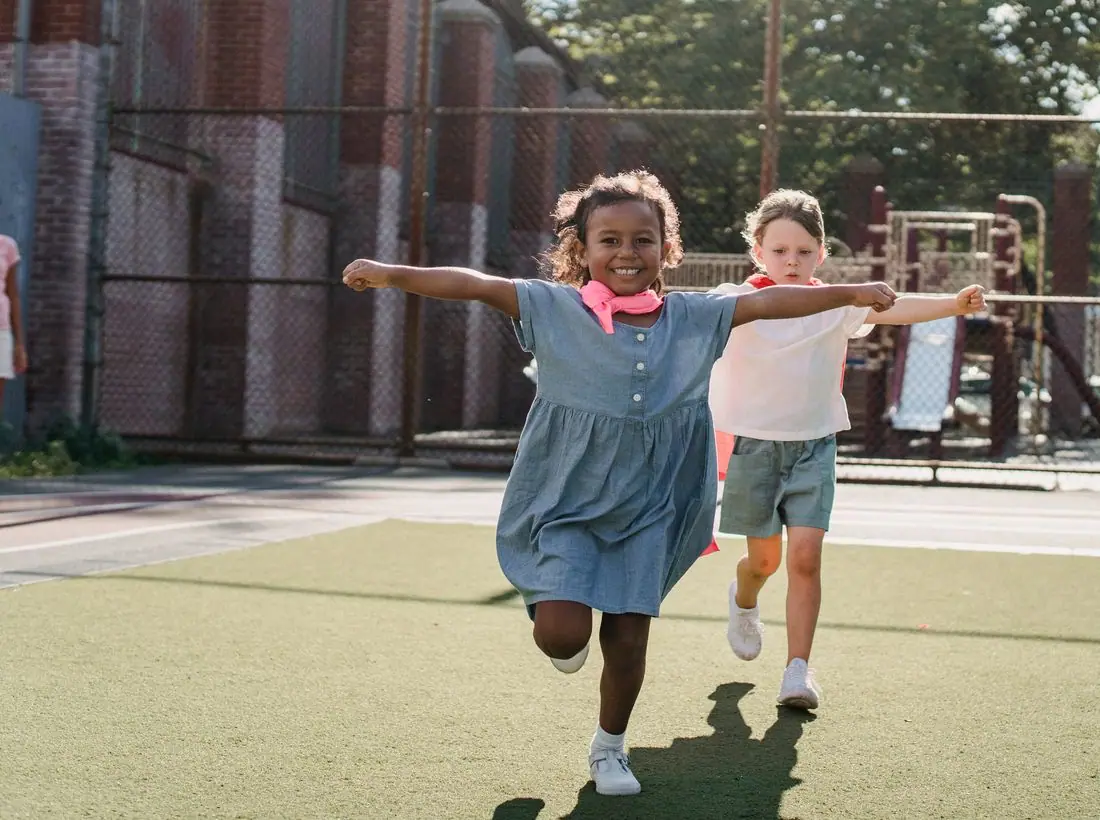
Bridge is a youth mentoring nonprofit site with teal blocks, a heavy rounded headline and a photo of children playing in a green field. It has a stats band showing matches, mentors and school retention.
- Built for
- Prospective mentors, parents and teachers who want to refer a student, and local sponsors.
- Navigation
- Sticky frosted bar with the full menu and a Give button. On phones, a bottom tab bar plus a quick-links launcher.
- Pages
- Home, About, Visit, Programs, Stories, Events, Donate, Contact
- Hero
- Headline beside a framed photo, with a small inset and the next-gathering chip.
Typography
Outfit Bold is used for both headlines and body text. It is a geometric sans with simple round forms, friendly and modern, and it looks as good at 90 pixels as at 16. One family keeps the page uncluttered.
Colour
The page is pale mint (#F1FAF8) with deep green-black text (#12312F), a teal brand colour (#138A7E) and a coral accent (#FF6F59). The hero sits on a soft aqua. The dark theme uses a bright aqua (#55D0C2). Teal reads as trustworthy and calm, and coral adds warmth for children.
Layout and navigation
A white bar has a teal logo tile, six links and a teal Donate button. Below are tinted cards for programs, stats counters for 420 youth matched, 310 mentors and 94 percent staying in school, and layered photos. The structure is easy to follow on a small screen.
The hero
The hero is split. 'Every kid needs someone in their corner.' fills four lines on the left, with a line on how many students stay in school. On the right a tall photo of children jumping in a misty field has a smaller sunset photo overlapping. A chip shows the next Family Night.
Calls to action
'Become a mentor' is a teal pill and 'Refer a student' is outlined. The two buttons serve the two people who must act for a child to be matched. Donate is in the header.
Photography
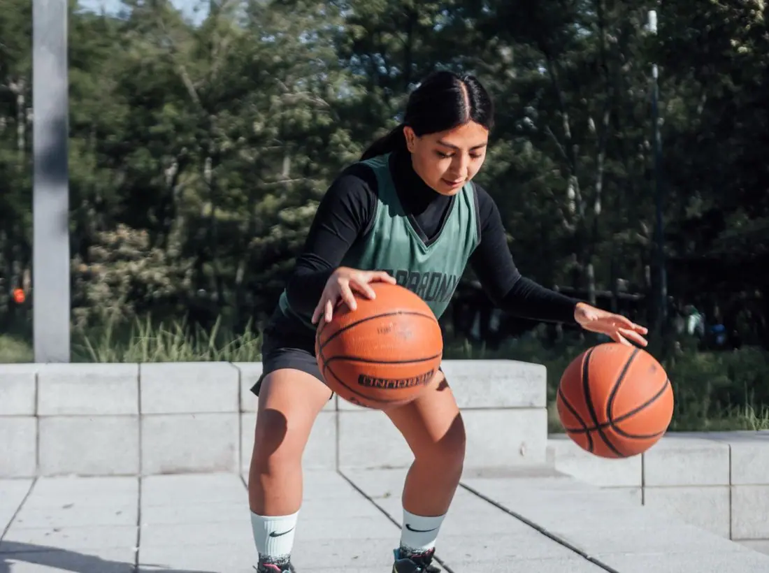
The main photo is bright and full of movement, which suits young people. Photos of children need written parental consent, and a real program should choose images that show activity and avoid anything that identifies a child's school or home.
Accessibility
Dark green on mint is about 13 to 1. White on the teal button is about 4.2 to 1, which is below the 4.5 target for small text, so the button labels are large and bold, and a real build should darken the teal slightly. A theme toggle is in the header.
Type system
- DisplayOutfitOutfit is round and direct, and it looks at ease on a poster for kids and on a letter to a funder.
- TextOutfitUsing Outfit for body text keeps the voice consistent and makes the stats easy to read.
Colour and contrast
Each text pairing is checked against WCAG 2.2 in both themes. Ratios are computed from the exact theme colours.