Why Bayanihan Fellowship looks the way it does
A site for a Filipino-American church whose life runs on night shifts, care groups and a very serious kitchen. It leads with real faces and food, and organizes everything around when people actually get off work.
- Built for
- Filipino-American families in Daly City and northern San Mateo County: hospital nurses and caregivers, airport staff, students and their lolos and lolas, plus new arrivals from the Philippines.
- Navigation
- Tabbed app bar. Pages behave like tabs in an app: a sticky segmented bar under a compact header.
- Pages
- Home, Sundays, Care groups, Salu-salo, Typhoon relief, Our story
- Hero
- a drawn neighbourhood map as the opener, with numbered pins for each stop or campus and a list of names, addresses and times beside it; pointing at a list item lights up its pin. Built for mobile pantries, multi-site churches and bus routes. Variants: a = map on the left, headline and stop list on the right; b = headline across the top, a wide map, and the stops as columns beneath; c = a route: stops as a connected timeline beside a map with the path drawn between pins; An asymmetric mosaic of five photographs with the headline locked into one cell of the grid, so the first screen shows real people before it says anything. Variants: a = headline block top-left beside one large photo, three smaller below; b = a tall photo leads and the headline sits low on the right; c = a triptych, with the headline in the middle panel between stacked photos; One impact number is the hero (for example meals served this year), with a line naming the unit, a sentence of context, a row of three supporting figures and one photograph. The number counts up once when it first comes into view. Variants: a = the number spans the full width above the photo and figures; b = photo on the left, number and a ledger of figures on the right; c = the number sits on a coloured panel that overlaps the bottom of a wide photograph
Typography
Sora carries the headlines: wide, sturdy and friendly, with enough room in its letters to set long Tagalog words without crowding. Plus Jakarta Sans, designed for Jakarta's city identity, handles reading text, a Southeast Asian typeface for a Southeast Asian congregation that also reads crisply on phones.
Color
The blue and red come from the Philippine flag, softened toward the denim blue and tomato red of a jeepney's paintwork so they feel lived-in, not official. Neutrals are a cool gray-blue borrowed from Daly City's afternoon fog.
Layout and navigation
A tabbed app bar sits under a compact header, so the site behaves like the apps this audience already lives in. Six short tabs, each with a Tagalog label when the language switch is on, and the persistent action is 'Find a care group', because groups are where people actually stay.
The hero
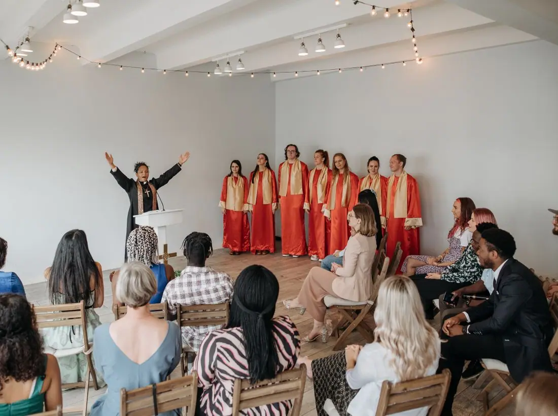
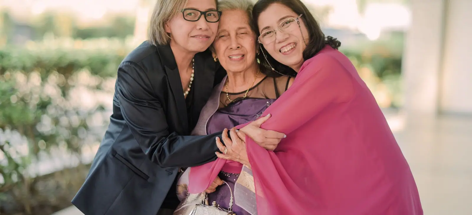
A five-photo mosaic leads with a family, a buffet table and the volunteers before any words. For a community that judges a church by whether it feels like home, showing the long table first says more than a slogan. The headline then explains the name in one image: neighbors lifting a house.
Calls to action
Actions are concrete and local: 'Find a care group', 'Bring a dish', 'Fill a relief box'. The second Sunday service is named for who it's for, 'After-shift service', so a nurse coming off nights knows it was planned with her in mind.
Photography
Food, families and work clothes over stage lighting. Relief pages use photos from partner churches in the provinces, with captions naming the town, so donors can see where boxes go.
Bilingual approach
Headings, buttons, schedules and labels are in natural Tagalog when the switch is on. Longer paragraphs stay in English, as they would in the fellowship's own Taglish bulletin, rather than risk stiff machine-style Tagalog that older members would notice at once.
Accessibility
Body text is 17 pixels with generous line height and AA contrast in both themes. The weekly schedule marks today's column, and the visit page says plainly that scrubs and airport uniforms are normal on Sunday afternoon.
Type system
- DisplaySoraA wide, sturdy geometric sans with open counters; it holds long Tagalog words like 'pagkatapos' without feeling cramped.
- TextPlus Jakarta SansDrawn in Jakarta for a Southeast Asian city's own identity, it is warm, compact and clear at phone sizes.
Colour and contrast
Every text pairing is checked against WCAG 2.2 in both themes.
Light theme
| Pairing | Sample | Ratio | WCAG |
|---|
| Body text on page | Aa | 14.29:1 | AAA |
| Body text on cards | Aa | 16.24:1 | AAA |
| Secondary text | Aa | 5.69:1 | AA |
| Links | Aa | 7.79:1 | AAA |
| Button text | Aa | 8.86:1 | AAA |
| Accent label text | Aa | 5.21:1 | AA |
| Text on dark bands | Aa | 14.29:1 | AAA |
| Muted text on dark bands | Aa | 7.65:1 | AAA |
| Text on brand bands | Aa | 8.86:1 | AAA |
| Muted text on brand bands | Aa | 5.79:1 | AA |
Dark theme
| Pairing | Sample | Ratio | WCAG |
|---|
| Body text on page | Aa | 15.46:1 | AAA |
| Body text on cards | Aa | 13.62:1 | AAA |
| Secondary text | Aa | 6.92:1 | AA |
| Links | Aa | 8.83:1 | AAA |
| Button text | Aa | 9.29:1 | AAA |
| Accent label text | Aa | 7.87:1 | AAA |
| Text on dark bands | Aa | 16.6:1 | AAA |
| Muted text on dark bands | Aa | 8.39:1 | AAA |
| Text on brand bands | Aa | 9.29:1 | AAA |
| Muted text on brand bands | Aa | 5.57:1 | AA |